Catalog Design Ideas
A well-designed catalog plays a very important role in building the image of your brand, whether it's a catalog online or printed. Without a proper design, the marketing offer of your company will feel incomplete and your sales will drop. As marketing professionals know, catalog design is not just about using a collection of your catalog templates, but also knowing how to use them in practice and when to abandon the template. Read on to learn how to find creative designs for your product catalog.
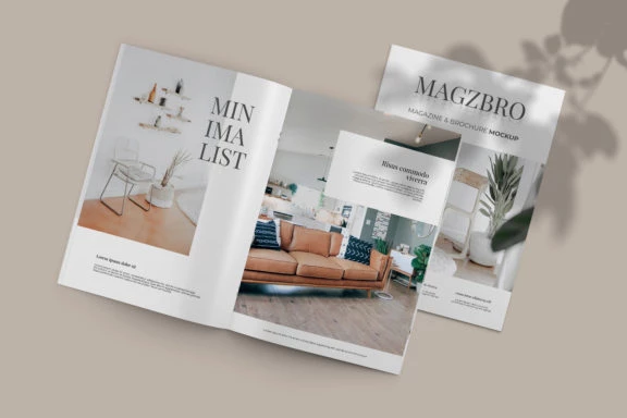
Source: Freepik
Whether you design mobile video games or industrial machinery, putting your online catalog using Publuu is a great way to attract new customers. Publishing the brochure detailing your products or services is not only good for getting the word about them out, but it also helps your prospective customers and investors learn something about your brand. A well-designed catalog is not just your calling card, but also a guide to what you have to offer. Have a look at one of the Publuu's example below.
Publuu’s catalog example
Tips to design your perfect product catalog
Keep it simple and sweet
Be comfortable. If you're not a professional graphic designer, you can find design services to help you with your layout. But there's nothing wrong with a small company simply using the product images, catalog templates, and pre-made elements just to showcase their offer. If you aren't feeling creative, you can also create a product catalog using a template and simple tools like Word or PowerPoint.
Keep it simple. Smaller companies can easily showcase their products, prices, and key strengths on just a few pages. You want to attract customers, not to create works of art. If you need a short brochure, you can use a pre-made catalog template. And with Publuu, you can give some extra spice to your brochure: this tool can mimic the real feel of a paper catalog, which many people will probably find interesting enough. You can configure it using backgrounds and sounds, to improve the final impression.
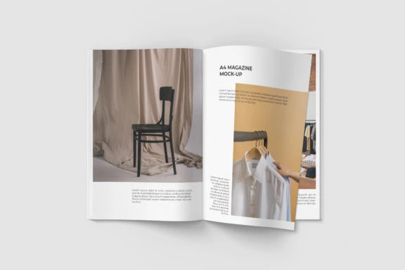
Keep your product descriptions short and succinct. There's no room for poetry in a product catalog. Some design templates only offer small boxes for text, but when you acquire more creative design skills (or hire professionals), you'll learn how to use them effectively. In any case, you do not want to overwhelm the reader with a wall of text. Try to avoid using specialized language and slang, even if it makes you sound more professional - all new ideas should be explained to any laypeople to help them find your content.
Your online product catalog is meant to be read
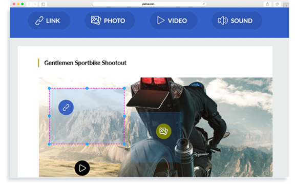
Use calls to action and hyperlinks. You can place contact links for your social media. You can also use Publuu's unique hotspot feature to easily place them in the published document. You can improve your customers’ online experience, by providing online photos or videos online. And if you post it on your Facebook or LinkedIN profile, the prospective customer will be able to contact you with just two clicks!
Another type of text you can use successfully is quotes. Your mission statement, bolded or highlighted opinions on you, your products, and services can liven up your catalog, especially if you do not have that many exciting graphical elements in your template. An unusual typeface contrasting with the normal font of the layout is sure to catch the attention of the reader. To show that it's a quote, use the formatting provided by your catalog templates, like boxes, bars, quotation marks and name of the author. Of course, remember to obtain their permission for endorsing you!
The true professionals also know what font styles to use. You can read more about them elsewhere, but in general, there are two main types of fonts - serif (with bars and dots) and sans serif, without such embellishments.
The first type is easier to read, but the second one makes skimming the text far easier. If you use sans-serif for your main body of text, you should use serif fonts for headings or titles, or vice versa. The fonts should be consistent and similar thorough your entire content.
Use graphics and creative design templates
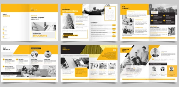
Source: Freepik
Use online graphic resources to find your perfect design template.
Don't be afraid to present as many images of your products as possible. Your customers want to evaluate your work before they pay for it. And if you offer services or non-material products? Well, there are always some solutions you could put in the product catalog. If you're a fitness coach, some design templates might offer a before/after option - showcase the results of your work or screenshots of your creative achievements.
In your brochure, you can use images in a variety of ways - many catalog templates use boxes where you can place your product photos, but you can expand them to dominate your entire layout. Often, images styled as "page splash" can draw attention to your entire design. People tend to focus on the images first and then the printed text.
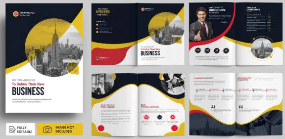
Source: Freepik
But photos aren't the only type of images you can utilize. You can also rely heavily on other images, like frames, icons, vector graphics, or illustrations. Many templates look better with a hand-drawn style, especially when you're advertising creative design services or similar work. Vector graphics can be made as large or small as you'd like and the colors can be easily changed to match the layout of your brochure and the image of your company.
Find catalog templates that use contrast and color
Images are a great way to organize information, but you can also use colors to design your pages. Color blocking uses similar and contrasting colors to create divisions of space or blocks that blend together. You can use these blocks as free space and fill them with text and your own graphics... and you can always use the colors that suit the product, brand or company. You can use colors to connect and link different areas of the PDF, and using a consistent color scheme will help your layout.
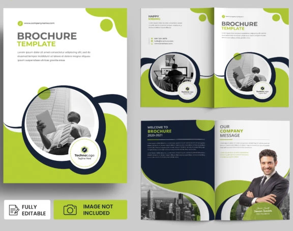
Source: Freepik
You can also use lines, curves and boxes to draw the readers' attention to important content. Dotted or zig-zagging lines or diagonals can break the monotony and provide movement, while various symmetrical boxes can create a pleasant impression of stability. As usual, everything depends on your catalog design and the template or idea you are following. More dynamic images don't require a lot of comic-book styled additions to be effective on their own.
You can find thousands of professionally designed templates on the Internet, so you don't have to design from scratch. On this site you'll also find all sorts of examples and suggestions from the professionals in the industry. Publuu also lets you also customize the look and feel of your catalog and how it displays, which can also work well with your brochure layout and design./p>
What should be found in your product catalog?
There are some areas in the catalog that every brochure like this should contain. The front page should feature the most attractive image, a descriptive, succinct title, and a brief description of the contents. If you update your offering frequently, make a note which edition this is. You can maintain an archive of the previous issues if you'd like to!
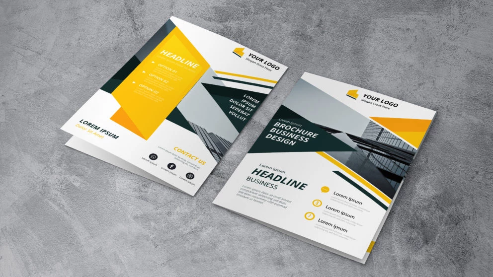
Source: Freepik
Your product catalog needs a table of contents that lists all the sections and descriptions of your business offer. Of course, if it's merely four pages long, it doesn't really need a long description.
However, it should include an introduction. If your product catalog is aimed at people who don't yet know your brand, company and the situation on the market, you can be as detailed as you like. If you have already gained some fame, perhaps establishing yourself as an industry leader, feel free to start with introduction of new elements of your offer.
The back cover of your product catalog should also contain contact information - you can also include some interesting offers that you want your reader to remember.
Use Publuu to collaborate on your catalog template
Publuu is a great tool to showcase your digital catalog to your potential customers, but it's also a great way to present your ideas and make view look like a real brochure. Graphic designers can use this tool to create interactive previews and ask for opinion on your catalog template and ideas. You can quickly update the interactive flip book with a new version and efficiently view spreads and double-pages.
Publuu’s catalog example
Using Publuu allows you also to quickly connect with friends and advisors who don't want to or can't download the pdf onto their computer - perhaps they're using workstations or mobile devices. You can also embed it on your website or even configure a site using the prepared templates. It doesn’t matter whether you view it on a tablet, smartphone or laptop, the catalog will look great on any device. Anyone who can visit modern websites will be able to offer you feedback and help design your catalog templates in the future!
Another spectacular advantage of publuu's catalogs is Lead Generation feature. Thanks to this new feature, you can easily capture high-quality leads from your readers. Lead forms embedded into your online catalog will let you establish a database of reader emails for newsletters, contact, and more complex marketing efforts.
You may be also interested in