30 Magazine Layout Design Tips and Ideas to Inspire Your Next Issue
Creating a magazine can be a great idea - whether it's to introduce a new source of news or celebrity gossip, showcase your offerings, or share your ideas with the world. With simple design tools, anyone can create and publish a magazine online.
Publuu's online magazine example
However, creating a good-looking magazine layout is not that easy. If your graphic design skills are still in the beginner phase, this article offers tips and tricks for both beginners and advanced InDesign users. Keep reading for more help on design and magazine layout ideas.
What is the layout of a magazine?
The layout of a magazine page essentially involves arranging its elements in a visually appealing and easy-to-read way. You need to lay out text, illustrations, headlines, and empty space in a way that doesn't overwhelm the reader and encourages them to read the entire piece.
The layout should guide the reader's eye, showing them what to look at first and where to go next. Different types of magazines can have different styles. For example, a fashion magazine might use a lot of large photos, while a news magazine might have more text.
30 tips to design a magazine layout
1. Balance visual elements
Whitespace is not simply background for your content - you'll find that spacing matters. It separates paragraphs and sections and can emphasize headings. However, too much whitespace is also a mistake; it creates the impression that you have nothing to say. Use it strategically to lighten up the text pages.
2. Integrate images with whitespace
Whitespace is also a border for illustrations; it separates them from the text and preventing them from melding together. When photos are too close to the text, it makes it harder to read - try to keep a buffer of two or three characters' width from the main text to enhance readability.
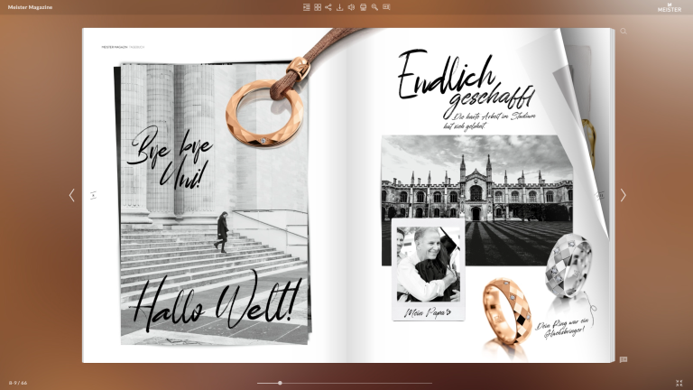
3. Concentrate on key visual components
Ask yourself: What do I want the reader to focus on? Do you want to draw attention to a crucial quote? If so, make it stand out! Add backgrounds and frames to highlight important images, or break up the regular layout to create a unique feel.
4. Establish a clear visual hierarchy
Readers generally assume that the larger the headline, the higher its importance. They are also guided by color rules - for example, black contrasts with bright colors. If headlines are red, the reader will perceive blue text as less relevant.
5. Use size contrasts
Ask yourself - shouldn't this element be bigger? Sometimes the answer will be “yes”. In general, novice creatives often underestimate the effect that contrasting sizes can have on viewers. Don't hesitate to make important components much larger.
6. Integrate interactive elements in Publuu
Publuu can help you turn a boring PDF into an interactive magazine. With our platform, you can add animated GIFs, slideshows, or YouTube videos to make your magazine stand out from the crowd. Just upload your PDF below:
7. Break up walls of text!
When creating a layout, think about what the reader is supposed to look at. What is the visual point here? Traditional books can afford to have no illustrations, but magazines need to catch the eye and win new viewers every month.
8. Use vector and raster graphics for unique designs
Vector graphics often show cartoon elements in hand-drawn style. By combining them with raster graphics and photographs, you can create a precise layout that will appeal to diverse preferences.
9. Use color theory
Recall the rules of complementary and contrasting colors. For example, red contrasts well with blue and purple. However, it can look blurry against a yellow background and may look messy when combined with green and orange.

10. Create bold magazine covers
Today, most covers rely on one bold element to grab the viewer’s attention. This is not a bad tactic - if you choose the right focal point. You can also stand out from the crowd by using an unusual combination to capture interest.
11. Apply gradients (if necessary)
Gradients may be associated with cheesy corporate presentations, but they add depth and sophistication to professional magazines. You can also add permeating effects to easily link graphics to the background.
12. Organize content in columns
Most magazines these days use a two- or three-column layout, depending on the page dimensions and font size. Take a look at your competition and typical design standards to determine the best approach.
13. Select good typography
Choose fonts that reflect the personality of your magazine and combine them thoughtfully. As a rule of thumb, people raised on online content choose sans-serif fonts, while older people prefer serif fonts, although this is not a strict rule.
Sometimes a magazine can also be associated with an iconic font. For example, independent zines often choose monotype fonts to look as if typed on a typewriter.
💡 Check out 10 best free magazine fonts in our Knowledge Base
14. Limit colour palette
The more bright colors you use, the less professional your magazine may look. Consider the proposed color palettes in software like Adobe Photoshop - they generally only offer six or eight complementary shades. Using too many colors can distract from the content.
15. Maintain brand consistency
Keep the style of the magazine consistent across all issues to build brand recognition. Publuu can help enhance your PDF design with customisable icons, animated backgrounds, and embeddable animations.
16. Design cohesive spreads
Remember that the reader always sees the entire spread, even if one page contains an advertisement. Try to view the spread as a single design unit. For instance, if the left page is dominated by a full-bleed ad photo (say, a model), balance it on the right with text and smaller supporting visuals - rather than another oversized image. Using digital flipbooks from Publuu will help you visualise what the design will look like as you flip through the pages.
💡Read also: What is a double-page spread?
17. Focus on top section
Place crucial content in the upper third of the page, where readers' attention naturally gravitates. This is where we expect to find the title and often where tips or lists can be found.
In Western cultures, people tend to move from the top left corner to the bottom right corner. Imagine the reader's persona: they turn the page and move on to the next part of the text. What will they see? What will his visual journey be like? Will they skip over the adverts or move on to them?
19. Streamline the flow
Create clear, linear paths for readers to follow throughout each spread. If you want to play with the story and information, add arrows and other visual cues to guide the reader.
20. Match the layout to the magazine's purpose
The purpose is not only the target audience but also the reason for its creation. For example, one board game magazine wants to promote the gaming culture in the country, while another may focus on promoting the publisher's products.
Both are aimed at the same target group, gamers and potential gamers. In the first case, the layout should be friendly to attract new fans; in the second, it should be consistent with the company's other products.
21. Maintain visual rhythm
Distribute content evenly across pages and spreads. A repetitive rhythm creates a consistent layout. For example, try to think in terms of 3 x 3 grid - that is, where a page consists of three rows and three columns. The text box should not take up only a quarter of the page.
22. Define information hierarchy
The larger the font, the more important the text. For example, you may want to establish a hierarchy of headings, then use bold and larger point sizes for highlighted content.
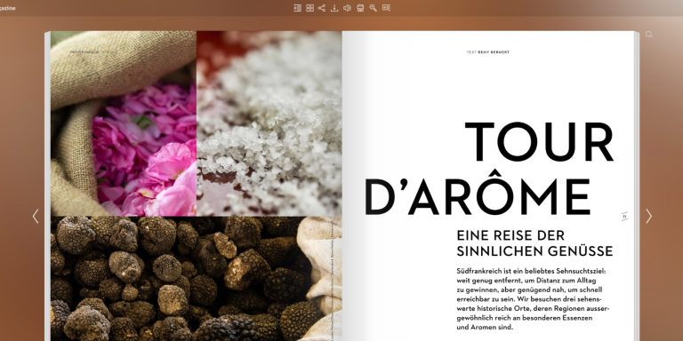
💡Check also: Best newspaper fonts for your headlines
23. Optimize readability
Select fonts and sizes that enhance legibility. Aim for a font size between 10-13 points for body text, with line spacing (leading) set to approximately 120% of the font size.
24. Strive for the ideal line length
Keep the line length between 50-70 characters for optimal readability. Depending on the size of the frame and field, you may want to split the text into two or three columns.
25. Structure text effectively
Try to break up large, overwhelming paragraphs into smaller sections. Divide them into concise sentences so that readers can quickly scan them with their eyes and grasp the meaning.
26. Use bullet points
Bullet points and highlighted elements will allow you to create clear entry points for readers. People often treat bullet point lists as summaries and synopses, making it easier to digest information.
27. Tailor design to medium
When planning your magazine, consider the medium as well. Print magazines have their limitations, and online magazines can sometimes look poor. Publuu combines the best elements of both print and online format, so it allows you to create professional magazines for everyone.
28. Use page margins
Page margins aren't just for blank space - you can use them for page markers, numbers, or even embellishments. Remember that your text needs to breathe, but don't be afraid to put content in the margins when appropriate.
29. Include links
For online magazine, adding links can increase engagement and hold the reader's attention. Publuu makes it easy to add interactive hotspots to your PDF once it’s created.
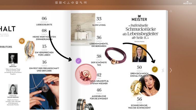
30. Ensure a good table of contents
If you are using tables, have your table of contents follow their formatting. It needs to be readable and easy to navigate. With Publuu, you can build an interactive table of contents so readers can jump straight to any article with a click. For a step-by-step guide on creating a table of contents, visit this page.
15 Magazine layout ideas
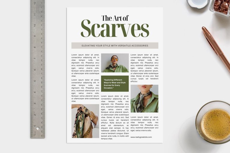
1. Green and beige magazine layout
This green-and-beige fashion layout strikes a nice balance between imagery and copy, so the pages feel stylish without being hard to read.
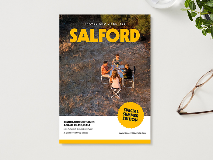
2. White and yellow travel magazine layout
This contrasting layout draws the reader's attention and directs the readers to the cover.
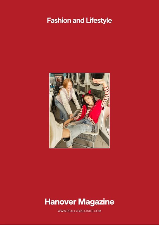
3. Minimalist fashion magazine
The flashy and professional cover of this digital magazine will certainly draw the attention
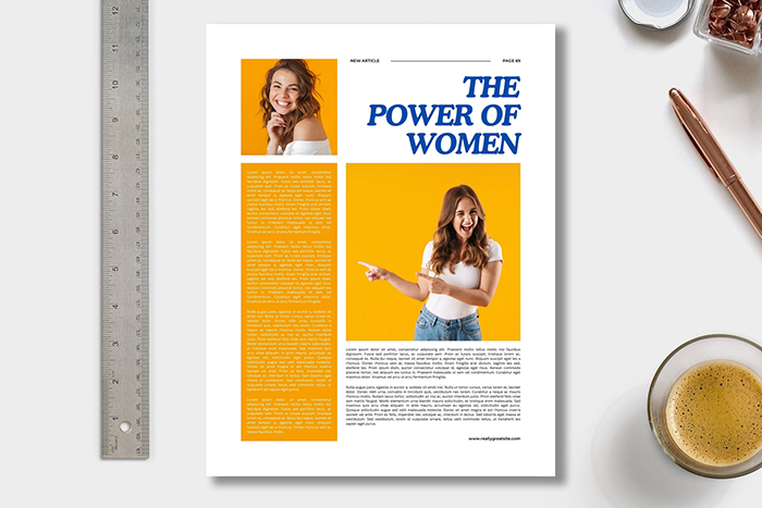
4. Minimalist lifestyle magazine
This magazine layout adds some colorful splash to your magazine, helping you focus on the important matters.
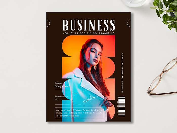
5. Creative minimalist business magazine template
This magazine cover template relies on contrast and heavy effects to draw the attention to the central figure.
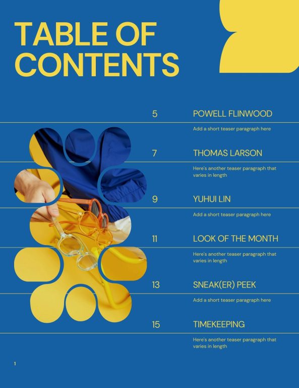
6. Modern style magazine layout
This template offers 22 varieties of pages to help you in magazine design. The friendly blue tones and visuals definitely will speak to the imagination.
7. Cover page design
You can create good looking magazine in MS Word without hassle. In our list you'll find many graphical elements you can include in your editorial design.
8. White modern layout template
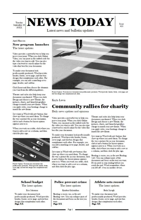
Anyone can create their own magazine using this MS Word template, available to users of Word online.
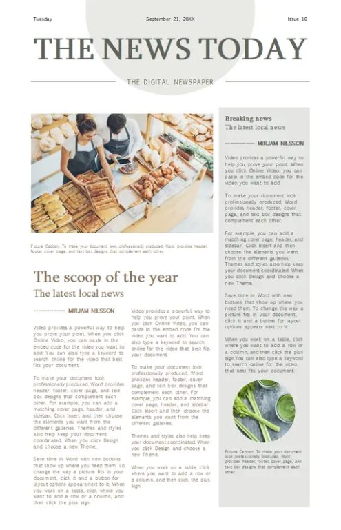
9. Modern news magazine layout
This magazine layout design is softer than a typical newspaper, so you can easily adapt it to any magazine you need.
10. Modern cover page design
This template was made for a book, but you can use it to review your design elements and adapt it for magazines.
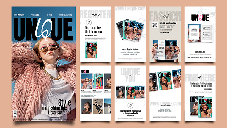
11. Fashion magazine template design
This unique fashion magazine templates lets you integrate your digital magazine with your Instagram stories.
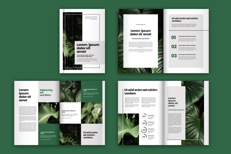
12. Green magazine template layout
This green themed magazine template is perfect for environmental issues or related to health.
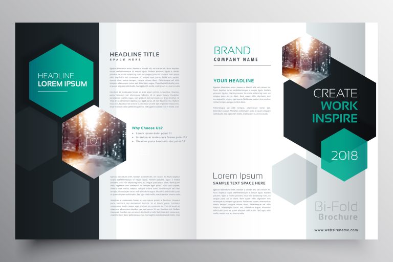
13. Magazine template with hexagonal shapes
Hexagon motif works well for technological brands but also let you draw attention to the main elements.
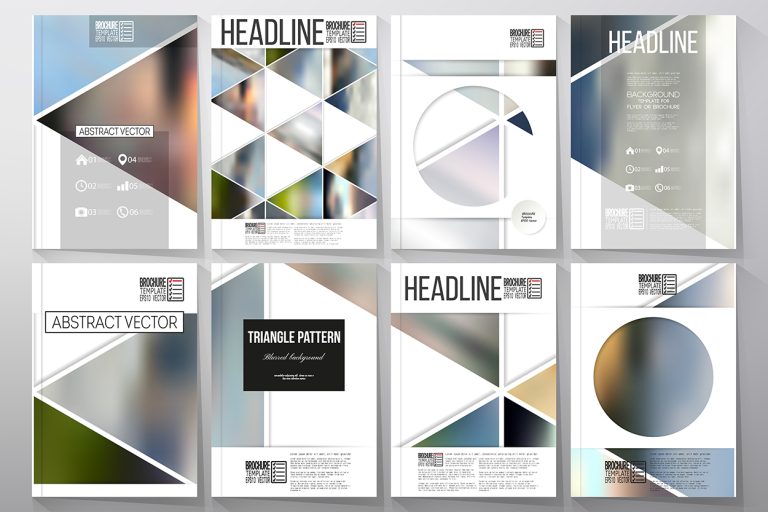
14. Abstract magazine layout
The collection of these backgrounds will help you design a well-balanced magazine layout that will be memorable.
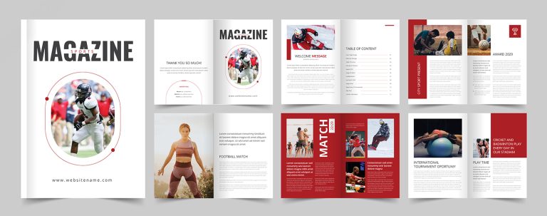
15. Sport magazine layout
The sports magazine layout relies on strong colors and contrasts. You can use them to design other graphical elements and use white space strategically.
FAQ about magazine layout
What is the format of a magazine?
Magazines typically come in several standard formats:
-
Standard size: Approximately 8.5 x 11 inches (215.9 x 279.4 mm). This is the most common size for general interest and trade magazines in the US.
-
Digest size: Around 5.5 x 8.5 inches (139.7 x 215.9 mm). Often used for reader's digest-style publications or specialized magazines.
-
A4: 8.27 x 11.69 inches (210 x 297 mm). Common in Europe and internationally. Some international magazine also can use the B4 standard, but it’s normally reserved for books.
-
Oversized: Larger than standard, often used for fashion or art magazines. Sizes can vary but might be around 9 x 12 inches (228.6 x 304.8 mm) or larger.
-
Digital formats: For online publications, magazines can be designed in various dimensions to suit different devices, but often maintain aspect ratios similar to print formats.
The choice of format depends on the magazine's content, target audience, and distribution method.
How is a magazine structured?
A magazine is typically structured in the following way:
-
Front cover: Featuring the magazine's title, main story highlights, and often a striking image.
-
Inside front cover: Often used for advertising.
-
Table of contents: Lists the articles and their page numbers.
-
Masthead: Contains publication details, staff listings, and contact information.
-
Editor's Letter: An introduction from the editor-in-chief.
-
Front-of-book (FOB): Short, quick-read articles, news items, and regular columns.
-
Feature well: The main body of the magazine, containing longer, in-depth articles.
-
Back-of-Book (BOB): Shorter pieces, often including reviews, listings, or a regular concluding column.
-
Inside back cover: Typically used for advertising.
-
Back cover: Often featuring a full-page advertisement.
Throughout the magazine, there may be advertisements interspersed between editorial content.
What are the 4 parts of a magazine?
While magazines can have many components, they can be broadly categorized into four main parts:
1. Cover:
- Purpose: To attract readers and highlight key content.
- Elements: Magazine name, main image, headline teasers, date, and price.
2. Front matter (front of book):
- Purpose: To introduce the magazine and provide essential information.
- Elements: Table of contents, masthead, editor's letter, and initial short-form content.
3. Main content (feature well)
- Purpose: To deliver the core articles and features of the magazine.
- Elements: Feature articles, photo essays, interviews, and in-depth stories.
4. Back matter:
- Purpose: To conclude the magazine with lighter or supplementary content.
- Elements: Shorter articles, reviews, classifieds, upcoming issue preview, and subscriber information.
Conclusion
Creating an effective magazine layout requires careful attention to both aesthetics and functionality. In our list, we've provided top tips that should serve to increase readability and drive more audience engagement. Whether you're working with print or digital formats, be sure to maintain design consistency while incorporating interactive elements when appropriate.
By following our tips, using Publuu, and taking inspiration from a variety of templates and examples, you can create a magazine that not only looks professional, but also effectively communicates your message to readers!
You may be also interested in:
The Best Online Bridal Magazines in 2026
20 Examples of Magazine Topics to Create Engaging Content
