How To Design a Brochure? Quick Guide
As a business owner in these trying times, you probably are looking for a way to advertise your products and services in order to appeal to your customers. You might be toying with all sorts of online advertising, but a marketing brochure is still a great idea, whether you print it out or use Publuu to create and publish your online brochures.
In this article, we will tell you how to design a brochure and how to distribute your brochure online. We'll describe the main brochure styles, how to write copy for the contents and how to choose good design for your pamphlets. Below, you'll find tips on the high-quality brochure design and creation of marketing material.
What is a brochure?
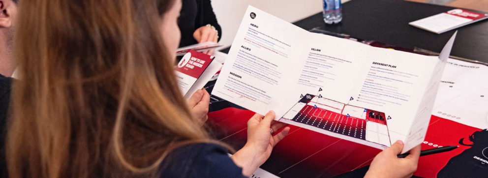
Leaflets that promote a company's products or services are referred to as marketing brochures. They're single or multi-fold pieces of paper that come in a variety of forms and sizes (however, with the advent of the digital era, they now also appear in digital variants, like the ones that you publish on Publuu.com). Depending on the country, many brochures are printed on a Letter or A4 sheets of paper. There are single-fold brochures, bi-fold brochures, and tri-fold brochures out there.
A brochure contains facts describing your business, your products or services. A good brochure can clearly and succinctly present your offer and what your company is all about and what you can do for your clients. If you choose good quality graphics, whether high resolution stock images or make photos yourself, you will be able to create the perfect brochure design.
What is a tri-fold brochure?
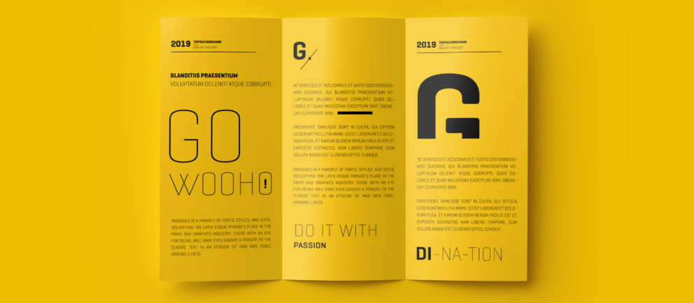
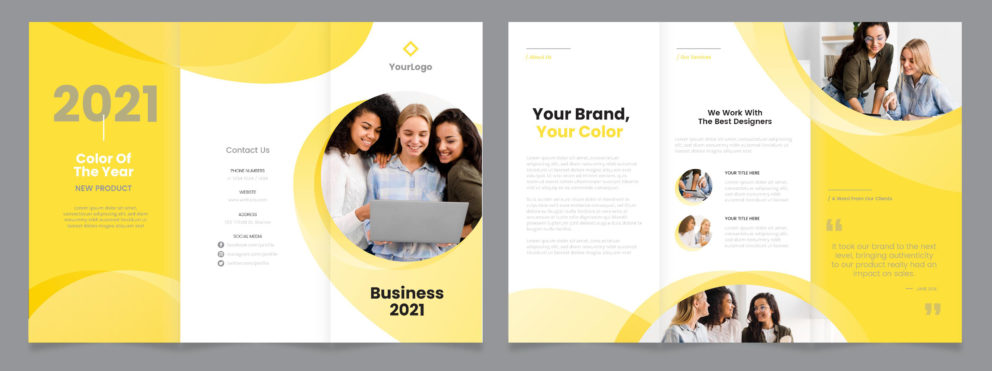
There are many brochure templates available online, whether to use in InDesign or MS Word. There are two main styles, but you can surprise your audience with unusual brochure design. The letter fold is another name for the most commonly used tri-fold brochure. This sort of brochure is designed to be folded like a letter enclosed in an envelope (hence the name) - there's a central section and two "wings": this type of brochure is folded in two places and split into three even rectangular portions.
Tri-fold brochures are an extremely versatile and practical form of promotion. They are not only inexpensive and easy to print, even on your office printer, but they also fold up nicely into a small, compact brochure that can easily fit inside pockets, handbags and purses, and regular letter envelopes. When they're fully opened, the reader can access everything you have to offer. Tri-fold brochures are also very simple to distribute and display in brochure racks on conventions or expos - and for businesses like travel agencies or private schools.
This classic brochure design can show all of your information in a gradual sequence when the reader opens the brochure. Because they will see each piece unveiled after the other ones, step by step, your brochure design will give that person the feeling of timing and order. Because all the three inner panels will all be seen at the same time, the material and visuals will also stand out, revealing the inner contents like a curtain. The brochure unfolds to reveal the most significant and engaging elements in the center: you decide what's going to be when working on your brochure design.
What is a bi-fold brochure?
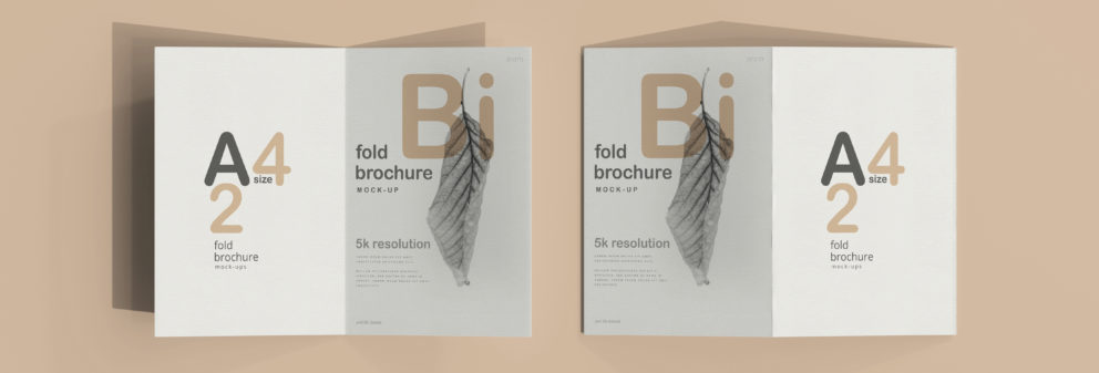
A bi-folded brochure, also known as a half fold, is simply a sheet of paper that has been folded in half. It neatly separates the brochure into two sections when folded in half width or height. It's worth noting that you don't have to make two equal pieces using this brochure design; if you need to, you can show some of the interior, folding them in 1/3rd, for example.
Bi-fold brochures tend to be much broader than tri-fold brochures, allowing for more creative options and playing with images and text. The bi-fold brochure, unlike the tri-fold, has just one-fold, allowing for larger or more photographs and blocks of text. The tri-fold can have six or four sections - if you see the back as a single one - which makes three-fold brochures more effective.
Another popular brochure design pattern is the gate fold - it also has two wings but instead of being folded like a letter it's instead folded like gate - it is more prestigious than the more classic design examples, but there are many free templates using this style as well.
What scheme to use is entirely up to you. Creating your pamphlet should be easy enough if you want to make your own brochure match your business identity. Brochure design makes it easier to customize the crucial points and showcase them to your audience.
Create an online brochure with Publuu
You can publish your brochure on our website publuu.com as a modern and interactive flipbook. To get started, simply upload your brochure online as a PDF.
This brochure can be shared with all your customers. You can send the URL of the online brochure to anyone without sending an attachment. This allows you to publish your great brochure on social media, embed on your website - or you can put a QR code on the printed brochure that leads to a PDF with more information.
Publuu’s brochure example
With Publuu, you can see if the customer has viewed it or not - you don't have to worry if your brochures have been thrown in the trash. You'll get notifications if a customer reads the brochure, or you can find out how much time a potential customer spent on each page of your brochure.
How to design brochure contents?
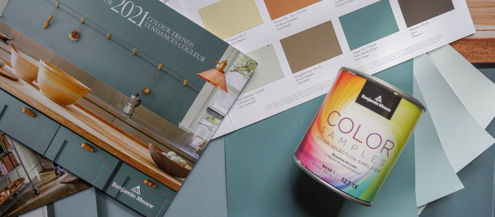
The first step in creating a brochure is to figure out who you're attempting to reach. Your brochure's language and visuals should be built with a specific consumer category in mind, whether you segment your market by age, purchasing power and income, region, ethnicity, or lifestyle choices. You can use user personas - modeling a couple of example customers who will use your products and imagine how will they react to your brochure contents. There are many templates allowing you to match your brochure design to your target audience.
Because a brochure is a communication tool, knowing your target market is critical. You'll be able to create and design engaging brochure content if you choose a brochure design that has more to do with your brand. If you own a photography agency, you might see yourself as an artist - but it's more likely that your target audience will be young people seeking to marry, people needing official photos or schools. You need two separate brochures for two market segments - one with wedding imagery and the other exuding your professionalism and willingness to work with small kids. Both will need completely different brochure design principles. The more you know about the demands and wants of your customer, the more successful your brochure will be.
Take the time to chat with your salesmen or even your consumers themselves if you're not aware of what they need. Ask them what has drawn their attention to your business. Make use of this feedback to create the optimal brochure design, combining what you're presenting and what your audience requires.
A strong first page means great brochure design
The reader's attention must be focused on the front page of your brochure. It's the first information on your business they receive in many cases. They should be compelled to flip the page by the contents of this piece of paper. You can use your best image possible to show your product - in general, avoid stock photos, you want to show the reader the style of your business, not general first impression.
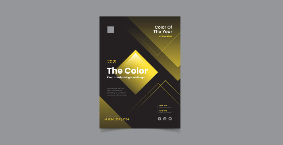
Source: Freepik
You know what they're saying: "there's never a second chance to make a first impression". The reader will take a glance at your business or brand in less than a second, jusst based on your brochure. They'll take a quick look at the cover of your brochure and determine for themselves whether they can trust your brand. This means that creating an eye-catching cover for your brochure or a fold front page for a tri-fold brochure should be your priority.
There are many ways to design a cover, you can rely on numerous brochure templates you find online. Different brochure designs work for different companies and businesses, so you must decide which brochure template is the best for you. Whatever design strategy you use, keep your creative text short and sweet.
Writing: Make a brochure sound natural!
When you're trying to put together the text in brochure, don't overwhelm the readers with all the accomplishments and successes of your company or all the information about your product or service. Too much information will confuse your target readers and weaken the brochure's message.
Keep your text simple
The more complex the words you use, the less credibility you will receive. It's easy to fall into the expertise trap - not every reader knows what you want to say, and many will not be impressed by the use of big, professional words in your brochure text. You want your brochure to serve as an advertisement for your business; your actions themselves will show the reader how good you are. The more often you use specialized terms, the harder it is to convey your main point.
Source: Freepik
It doesn't matter if you are writing for a college-educated audience or a 15-year-old teenager, your brochure copy should use simple and easy-to-understand words. Marketing experts advise that you should write the text for your brochure as if you were talking to your best friend. Your brand needs to be understood by the general reader - even if your target audience might be business professionals.
Use headlines wisely
Assuming you've managed to grab your readers' attention with the design, it's time to give them what they really want - information about your products or services. Your text must fit nicely into three sections, each with a headline and a brief description. That's when the fold of the brochure comes into effect - your brochure template could include a specific place for text.
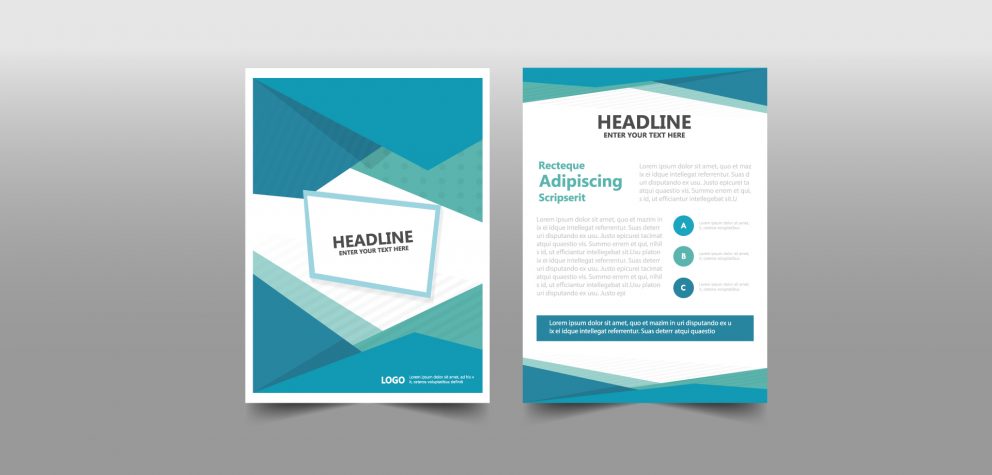
Use headings to introduce your brand's offer - a brochure is not meant to be read carefully; you need to show your content at the first glance. Headlines draw people's attention to the page and help them decide if they want to read on or throw the brochure in the trash. Make sure that you create your headlines in such a way that they pique the curiosity and excitement of the reader.
Your headlines should clearly and concisely present your offer or product so readers can see at a glance what you are promoting and trying to sell. They also need to be obvious - without the need for further explanation. Try to avoid empty words like "introduction" or "information" in favor of more prominent descriptors: "who we are", "our books".
Speak clearly
As always in marketing, you need to tell stories. You can make your brochures more attractive by harnessing the power of storytelling. Weave in the story of how your company started, or present a real customer success story. People think in terms of stories and identify with the characters - try to make them think about their success using your products or services.
People have seen all the cliched claims made by companies, and they don't believe simple claims like "the best pizza in town." Don't tell the readers of your brochure that you're the best, show it instead. Use simple and clear statements that demonstrate why your product or brand is different from the competition. Show facts, figures, and statistics, because that's always easy to verify. Remember to end with a call to action - add contact information on the last page or in the central section of your brochure.
Graphic elements of Brochure Design
Creativity in brochure design is important because it allows you to differentiate yourself from your competitors. Nowadays, when masses of creative, excellent artists ready to create an excellent brochure template are available online, uniqueness is the most important thing when you want to create a brochure from scratch.
Your brochure design must be original and unique, while still maintaining the original goal of reaching the customer and being readable. It is also important that the brochure provides recognition of your brand. Think of your brochure at an expo and consider how it can still stand out when it sits next to other flyers. Why would anyone reach for your brochure?
Choose your font wisely
When you start designing a brochure, it's easy to go overboard with the typesets or fonts you want to use. Many templates offer a selection of only a handful of fonts. While multiple fonts will certainly make you stand out from the crowd, they can also discourage others, especially potential customers. The best texts even consist of just two fonts - one for the body text and another - in several sizes and typefaces - for the titles. On top of that, you can add another one whether to highlight quotes or initials.

If your company already has its own font, start your brochure design with it - you can also rely on yout corporate branding. Your font and layout need to match your brand, your target audience and corporate style. If you are a small start-up, choose a sans serif font, if you want to appeal to large corporations - choose a serif one, considered more prestigious one. And of course, even if you produce comic books - especially if you produce comic books - don't use Comic Sans.
Brochure design elements like images, fonts, and colors need to fit your brand personality and the tone and content of the brochure. If you have a signature color and font, use it in your brochure design and layout and apply it to the templates you choose. You can use this font throughout the brochure or add one or two more to add variety to the pages of your brochure, making it look like a more legible pamphlet.
Choose your own images
Keep the reader in mind when designing the layout and choosing graphics on your pages. How would your ideal customer like to receive information? Can he read large blocks of text or does he need illustrations? Does he want realistic photos or abstract vector graphics? Would your company colors or fonts be particularly appealing to them? Where can you put all the information (such as company name and contact information) so it's easier for them to find?
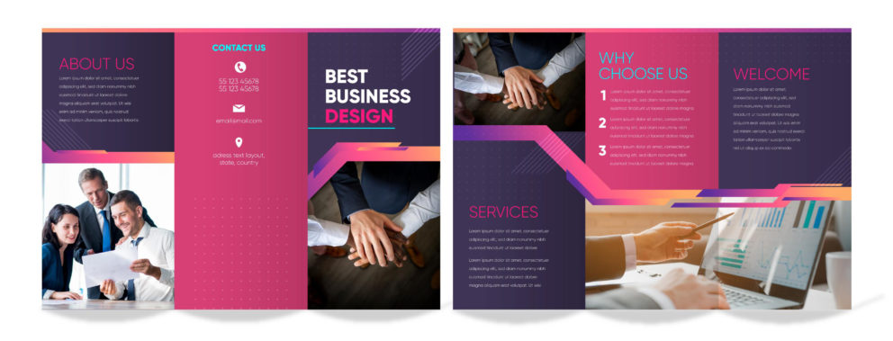
When it comes to color schemes, less is more. Marketing professionals' prized brochure designs usually have only one signature lead color (sometimes more, but two or three colors at most). This is where your brand colors can come in - consider whether they also fit the printed medium.
Choose the paper for brochure printing
Thin brochure paper makes a bad impression in marketing because it looks like a cheap printout from an office printer. Choose high-quality paper to make a good impression on your potential customer and inspire confidence. Although it is more expensive than regular paper, the good quality paper demonstrates that you care about the quality of your brochure.
The better the paper, the better the presentation of your brochure, and the longer it will last. Choosing quality materials and type of paper should be able to increase the value of your brochure and make it worthwhile to keep. This way, the user is less likely to throw away the brochure and will return to your designs in the future.
In general, the higher the paper weight is, the thicker the sheet. This translates into raw weight: GSM is the weight of one sheet of paper cut into a 1×1 meter square. The paper stock you select will show the quality and versatility of your brochure.
After you've decided on your type of paper, you'll need to decide on the finish of your page. There are a variety of finishes to choose from: Your brochure can be printed on matte paper with no gloss, semi-gloss paper, or glossy paper. Glossy paper will make your brochure look slick and more professional, but marketing experts and people who know how brochure design works claim that brochures that look like this can be harder to read and of course more expensive.
The finish you select is determined by the look and style of your brochure and even your brochure template. Discuss with your supplier the various options available within your budget and which printing materials will best suit your needs.
Publuu - Don't print your brochures!
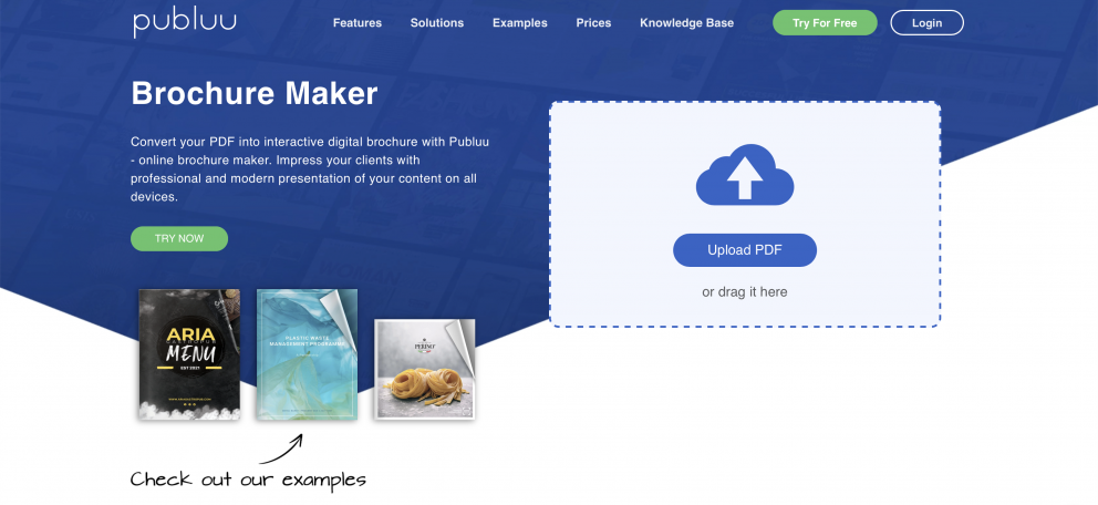
A digital brochure is delivered in a digital format that allows for easy reading and distribution - all it takes is a link to the online brochure. Companies use such brochures and are able to update them quickly and replace them with new, updated versions. They are easier to design yourself than printed ones, and they are also cheaper to create. You don't have to worry about the weight of paper or choosing the right colors for your brochure design.
A digital brochure retains vibrant colors and access to information, without having to overwhelm your customers with unnecessary details. Multimedia content - like galleries or videos in Publuu - allow customers to learn more about your brand. Publuu allows you to create professional digital brochures that can be easily opened on any device. Elegant design, amazing page-turning effect, navigation, and multimedia capabilities are just some of the effects that Publuu allows you to include in your brochure design.
Publuu’s brochure example
Thanks to this online flipbook maker you can effortlessly create a brochure or digital catalog and then promote it online. Publuu is a great solution that will give your users access to all the content you can offer and allow them to access most of the information. Digital brochures from Publuu work to your target audience seamlessly in a browser, without any additional applications, and they let the viewers access your brochure on Android or iOS.
Be sure to include all the necessary elements when you create your brochure design and promote your brochure among readers, and enjoy promoting your business in print. Start designing your brochure now, and upload them to Publuu to share them with the world!
You may be also interested in
The Best Online Brochure Maker in 2026
How to Make a Pamphlet?