12 Outstanding Brochure Design Ideas to Use Right Now
For a long time, brochures were a basic marketing tool. Nowadays, they can be easily distributed online and use the latest technologies, especially with the introduction of digital brochure templates. While brochure design might have stayed the same, its purpose has changed. They nonetheless remain an important marketing tool for businesses to deliver comprehensive information about their products and services in the ever-changing digital era.
As long as they're well designed, digital brochures can make a lasting impression on your target audience and elevate your brand statement by combining unique templates, captivating content, and strategic distribution so make sure that you find inspiration in outstanding brochure design ideas that we have listed below. Designers have explored new brochure design ideas, concerning size, design, color schemes, and layout as brochures have transitioned from print to digital media, broadening their applicability and appeal.

While social media marketing dominates the landscape, there is a strong case to be made for brochures' effectiveness in capturing potential customers' attention, especially if you use Publuu - Flipbook Maker to promote them.
However, nailing the perfect design can be difficult for both new and experienced designers. We've compiled a list of essential tips and inspiring ideas to help you master this art, ensuring your information is not only eye-catching but also easily digestible and shareable across multiple platforms.
Whether you’re working for a client or marketing your own business, these ideas will help you create a digital brochure that still looks great long after you hit "publish".
What makes a good brochure design?
The foundation of a good brochure design is a clear, concise, and visually appealing layout that expertly guides the reader through the content. Strong layouts strike a smart balance between white space, typography, and imagery, so the information is easy to take in without feeling crowded.
Keeping key design choices consistent, colors, fonts, and imagery, gives your brochure a cohesive look, strengthens brand identity, and makes it more memorable. In image-driven industries like fashion, it’s worth taking cues from well-designed fashion brochure templates.
A well-structured information hierarchy that highlights key points and calls to action will also engage the reader and encourage them to explore further. You’ll also find plenty of brochure templates online - use them as a starting point or simply as inspiration for your own layouts.
Another important aspect of a good brochure design is the content's quality and relevance. The copy should be informative, engaging, and tailored to the interests and needs of the target audience. Keep the copy tight, well-structured, and jargon-free, so it’s clear to as many readers as possible.

Make sure the tone sounds like your brand - when it feels genuine, it’s much easier to build trust. Consider also adding content outside copy, incorporating compelling visuals such as geometric shapes, high-quality images, infographics, and other visual elements that will not only capture the reader's attention but will also aid in the communication of complex concepts.
Finally, design with both the goal and the audience in mind. That means thinking through the format, how you’ll distribute it, and whether you need print, digital - or a mix of both.
When you get those details right, your brochure will feel more relevant to the people you’re trying to reach - and it’s far more likely to drive action. Below are some standout ideas you can use to spark your own brochure design.
12 best brochure design ideas
Make your digital brochure
Using Publuu - Flipbook Maker to publish your brochures can boost your marketing efforts, increase user engagement, and boost your brand's online presence with just a few clicks, that can create a brochure like the one below:
Publuu's digital brochure example
Publuu flipbooks provide an interactive and immersive reading experience, almost as if you were flipping through a physical brochure. This interactivity immediately grabs the reader's attention and keeps them interested in exploring the content and flipping through your marketing materials.
Because it’s built on HTML5, a Publuu flipbook automatically adjusts to different screens and devices - no extra installs, fonts, or downloads required.
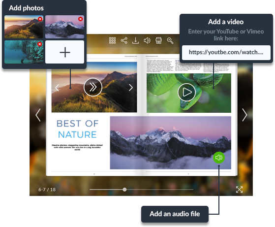
Publuu also lets you add multimedia, images, video, audio, and clickable links, so your brochure looks more dynamic, explains more with less effort, and feels more memorable to browse.
One more perk: flipbooks can be SEO-friendly, which helps search engines find and index your brochure. That can bring in organic traffic and make your content easier to discover online.
You can embed Publuu flipbooks on websites and share them through social media, blogs, or email campaigns. That makes it easy for readers to pass them along, extending your reach.
Organize your layout
Click on the image to download this template
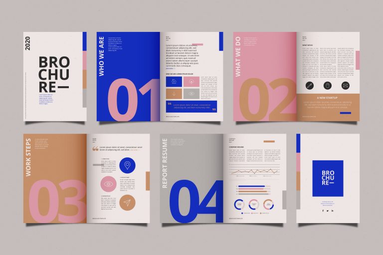
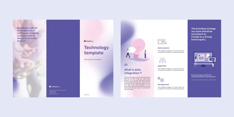
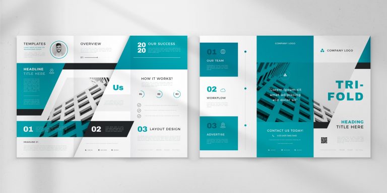
In a template like this, you can keep the layout tidy by sticking to a consistent background, using big numbered headings, and adding geometric shapes, simple icons, and a few high-contrast accents.
Brochure design templates like this one can create a visually appealing and user-friendly design that guides readers through the content effortlessly. Once you pull those elements together, the brochure becomes easier to navigate, nicer to read, and much clearer about what matters most.
Include interesting visuals
Click on the image to download this template
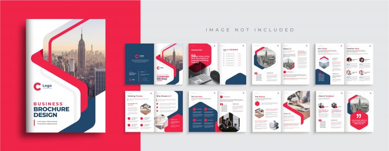
To organize a brochure layout effectively using brochure design templates like this one as an example, employ contrasting bold colors and bright red splashes to draw attention to key information. A repeated hexagon motif ties the whole design together and gives it a cohesive look.
There’s also plenty of room for copy, which keeps everything readable. Combine that with bold color and a strong visual system, and you get a brochure that’s eye-catching, well-organized, and clear.
Use relevant graphics
Click on the image to download this template
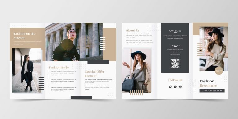
To create an engaging brochure using this trifold design template, you can use large, attention-grabbing photos that effectively convey your message and capture your audience's interest. Templates like these make it much easier to put together a brochure that looks polished, speaks to the right audience, and communicates your message clearly.
Make your content short
Click on the image to download this template
This is a great example of a minimalist brochure template done right. You can create a concise and impactful presentation by keeping the content short and to the point. Keep the text tight and give it room to breathe - too much copy (or too many visual extras) can make the layout feel messy fast.
Check the readability
Click on the image to download this template
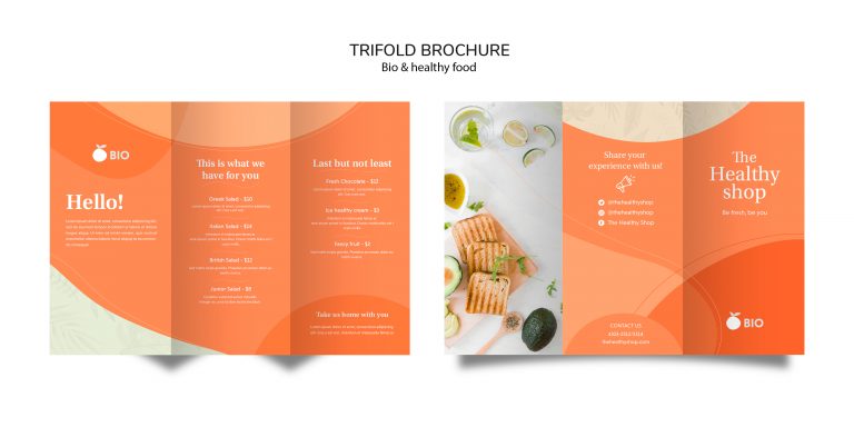
To ensure readability with your brochure designs, choose pleasant colors that create a visually appealing aesthetic while maintaining a background that does not overwhelm the reader. It’s also a strong example of using bold color to highlight key details and guide the reader’s eye. Clear, easy-to-read icons mark each section, so people can find what they need quickly.
Visualize data
Click on the image to download this template
This brochure design concept employs a monochromatic color palette that remains consistent throughout charts and graphical elements, ensuring a cohesive and visually appealing presentation. It relies on large, asymmetrical spaces for photos or visual representations that draw attention to crucial data points. Lean into a minimalist approach here - simple, clean, and focused on clarity.
Present statistics in a simple manner
Click on the image to download this template
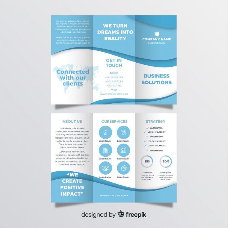
Usually seen in a medical brochures, to showcase statistics using this trifold brochure template, look at these easy-to-understand icons that visually represent key data points, aiding in quick comprehension. This template uses a clear divide between white and blue sections to organize information effectively and maintain a visually appealing layout.
Use irregular shapes
Click on the image to download this template
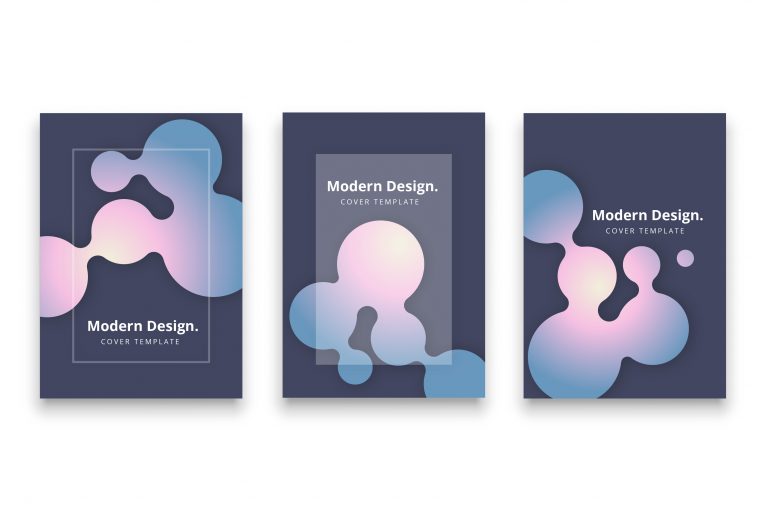
If you want a more playful look, irregular "blobby" shapes like these add movement and energy to the page. Pair them with strong contrast and lighting effects, and they’ll really pop.
Use pages to separate contents
Click on the image to download this template
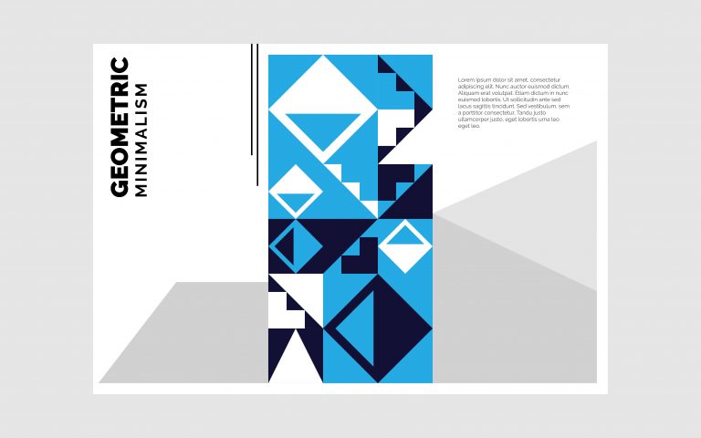
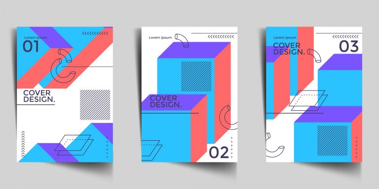
This design lets you use bold geometric abstract patterns effectively for creating accent pages, chapter divisions or drawing attention within a brochure or document. By using vibrant colors and distinctive shapes, these patterns create clear distinctions between sections, allowing readers to navigate with ease.
Use layers
Click on the image to download this template
This layout plays with layers - think black-and-white photos shot from unusual angles to add mood and visual interest. Those overlapping elements also help separate sections, creating a smoother flow and better readability.
Think out of the box
Click on the image to download this template
Embrace atypical design elements, experimenting with unique combinations of shapes, colors, and styles to create a distinctive and memorable presentation. To think out of the box when designing brochures, explore unusual color combinations that deviate from conventional layouts and capture the audience's attention. Using shading and texture can also add visual intrigue and dynamism to the design.
What are 6 things that make an effective brochure?

Clear and concise messaging
An effective brochure should have a clear and concise message that clearly communicates the benefits and features of the product or service being promoted.
Eye-catching design
Your brochure should look inviting at a glance - use the right mix of graphics, color, and typography to catch (and hold) attention.
High-quality images
High-quality images don’t just look better - they also help communicate the value of what you’re offering faster.
Targeted content
The content of the brochure should be targeted to the specific audience for which it is intended. That way, the message lands more clearly - and the brochure does its job.
Call-to-action
Every effective brochure needs a clear call to action - tell readers exactly what to do next, whether that’s buying, booking, or getting in touch.
Easy to read and navigate
The brochure should be easy to read and navigate, with clear headings, subheadings, and bullet points to help the reader quickly and easily find the information they are looking for.
What makes a brochure to stand out?

A brochure can stand out from the rest by incorporating the following:
Targeted messaging
A brochure that speaks directly to its intended audience with targeted messaging and information can stand out and make a greater impact.
Unique design
A unique and creative design that catches the eye and makes the brochure stand out from others.
Innovative format
An innovative format or size that is different from the standard brochure size or fold, can grab the reader's attention.
Compelling copy
The use of compelling copy that is attention-grabbing, engaging, and informative can make a brochure truly different.
High-quality printing
High-quality printing with rich colors, clear images, and crisp text can make a brochure stand out and look more professional.
Use of technology
Incorporating interactive elements such as QR codes, augmented reality, or virtual reality will make the brochure more engaging and memorable and more modern at the same time.
Unique paper
Using unique and high-quality paper can add a tactile element to the brochure, making it stand out from others that use more typical paper types.
What is the correct format of a brochure?

There isn't a single "correct" format for a brochure, as the format depends on the specific purpose, target audience, and content. That said, there are a few tried-and-true brochure formats and building blocks worth keeping in mind as you plan your ideas.
Brochure designs and layout
Choose a layout that suits your content and design goals. Common fold styles include:
-
Bi-fold: One sheet folded in half, creating four panels.
-
Tri-fold: A single sheet of paper folded into thirds, creating six panels.
-
Z-fold: A single sheet of paper folded in a zigzag pattern, creating six panels.
-
Accordion fold: A single sheet of paper folded multiple times in a zigzag pattern, creating multiple panels.
The format depends on the paper on which the paper is printed. Choose a size that fits your content and how you plan to distribute the brochure. Common sizes include letter (8.5 x 11 inches), legal (8.5 x 14 inches), and tabloid (11 x 17 inches). A4 (210 × 297 mm) is a popular international choice, while B4 (250 × 353 mm) gives you a bit more room for content and images.
Five crucial brochure designs
Your brochure design should also use these five elements:
-
Typography: Select clear, legible fonts that enhance your design and ensure easy readability.
-
Visual Elements: Incorporate high-quality images, illustrations, or graphics that support your content and create visual appeal.
-
Color Scheme: Opt for a color scheme that aligns with your branding and design goals, using contrasting colors to emphasize key information.
-
Content Organization: Split information into clear sections or panels, and use headings, subheadings, and bullets so people can scan quickly.
-
Call to Action: Feature a clear call to action that prompts readers to engage in the desired action, such as visiting a website, making a purchase, or reaching out to your company.
Which topic is best for your brochure?
Brochures are versatile marketing tools that can effectively convey a wide range of information. There is no single best topic, but they are commonly used in these contexts:
-
Business brochure: Showcase your company, its mission, values, and services or products offered.
-
Product or service promotion: Showcase a specific product or service, highlighting its features, benefits, and unique selling points.
-
Medical offer: Often used to promote a service or product, or to share patient-friendly educational information.
-
Events: Provide information about an upcoming event - a concert, exhibition, charity or meeting.
-
Travel and tourism: Promotes a destination by highlighting attractions, activities, and what visitors can do there.
-
Real estate brochure: Your real estate brochures can be used to showcase properties for sale or rent, including property details, pricing, and contact information.
-
College Brochure: An informational brochure that highlights programs, facilities, campus life, and other key details for prospective students and their families.
-
Wedding Program: A printed or digital document outlining the order of events and providing essential information for guests attending a wedding ceremony, such as the names of the wedding party, readings, and acknowledgments.
