What is a Double-Page Spread and How to Make It Right?
Double-page spreads can be a powerful way to enhance your designs and grab the attention of your readers! You can use them in printed magazines, catalogs, or flyers created with our flipbook maker, creating beautiful and professional layouts.

Our guide will show you the basics of creating impactful spreads, share useful tips, and give you examples to inspire your next project.
What is a double-page spread?
A double-page spread is a layout in which two pages of a book or magazine are set opposite each other and used together to create a single, large image or piece of text. When you open the book, you will see an image stretching across both pages - perhaps an attractive illustration or graphic effect.
How to make a double-page spread properly?
Creating a double-page spread is simple with most PDF editors. Follow these key steps to make it right:
Step 1: Set up your document
- Create a new document in Adobe InDesign, Affinity Publisher, or a similar tool, and set the page size (e.g., A4 or Letter).
- Make sure to set your document to facing pages mode, so that every pair of pages can be treated as a spread.
- Adjust the margins and bleed if necessary for print.
Step 2: Design your spread
- Focus on a central element (e.g., a large image or title) to grab attention across both pages.
- Make sure images, text, and graphics flow smoothly and are properly aligned, especially at the center fold. Use guides to maintain balance and positioning.
Step 3: Export the spread as PDF
- When your design is complete, export your document as a PDF file.
- Save the document as a full double-page spread, maintaining its layout across both pages.
Step 4: Split for digital viewing (optional)
If needed, split the double-page spread into two single pages using a PDF editor:
- Open your PDF in Adobe Acrobat or a similar editor.
- Duplicate the double-page spread.
- Crop the first copy to keep only the left page, and crop the second copy to keep the right page.
How to make double-page spread in Publuu?
If you're planning to use your prepared double-page spread in an online publication like flipbook, follow the steps below to set it up in Publuu.
🎥 Prefer watching instead of reading? Check out the video tutorial:
Step 1: Upload your PDF to Publuu
- Register to Publuu or log in to your account, then click ADD PDF.
- Upload your PDF that contains the double-page spreads.
Step 2: Customize your flipbook for double-page mode
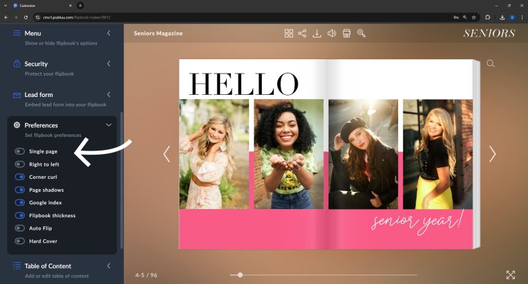
- Go to Customize > Preferences.
- Toggle off the Single Page option to switch to double-page mode. This ensures the flipbook will display two pages side-by-side, mimicking a real book or magazine.

Step 3: Save & Preview
- Once you've selected double-page mode, click SAVE to confirm your settings.
- Preview your flipbook to check if the spreads display as expected.
Step 4: Fix display issues (if needed)
- Add blank pages: By default, the front page displays as a single page. If there is a single page between the cover and your double-page spreads (such as a title page or intro), you must add a blank page after the front cover to ensure the spreads are displayed correctly in double-page mode.
- Avoid blank pages: If you notice that blank white pages appear between your spreads, it’s likely due to a single page being placed between them. Publuu automatically adds a white page when this happens. To prevent this, ensure your PDF is properly formatted with continuous spreads, or adjust the single pages to avoid disrupting the flow.
How to make your double-page spread even better?
After setting up your double-page spread in Publuu, there are several ways to make it more engaging and impactful:
1. Add interactive elements
- Clickable links: Link specific areas of your spread to external websites or social media.
- Multimedia content: Add videos, audios, or image galleries to create an interactive experience.
2. Publish and track
- Once you've finished all the improvements, click SHARE to make your interactive flipbook available for viewing. Publuu offers quick sharing options, so you can share it via a direct link or embed it on your website.
- Use Publuu’s tracking features to monitor engagement, including how many readers view your flipbook and which pages they interact with most. This helps you optimize future publications based on reader behavior.
Double-page spread examples
1. Online magazine double-page spread
This flipbook relies on the schemes of repetition and symmetry. It shows how you can use double pages to repeat traditional elements.
Publuu's online magazine example
MAKE YOUR OWN
2. Double-page spread in online catalog
This double-page spread uses facing pages to focus the viewer's attention on the building. The entire flipbook relies on these two pages to create a complete visual experience.
Publuu's online catalog example
3. Double-page spread in online book
For artistic books like this one, double-page spreads provide an opportunity to showcase beautiful images.
Publuu's online book example
4. Magazine example with double-page spread
Sometimes, your ad goes beyond the single-page view - like in this example. You can use a high-quality photo to draw attention to crucial features.
Publuu's online magazine example
5. NME magazine layout example

This spread from NME showcases the silhouette of Nicky Minaj and draws attention to the musician herself.
6. Double-page spread with text and image

This example shows how an image on the left-hand page can coexist with text, serving as a complementary illustration.
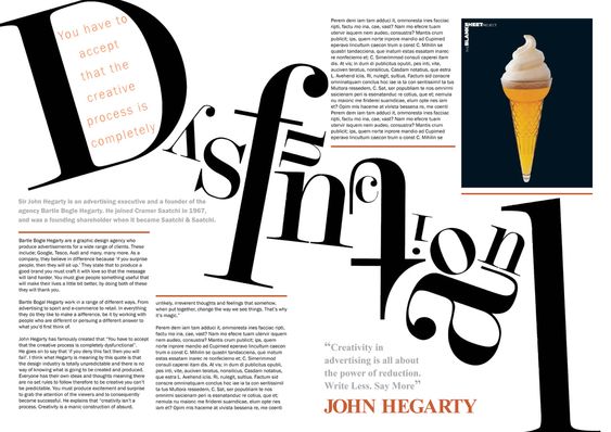
7. Double-page spread with creative title

The title in this spread serves as an excellent illustration of the creative process, compelling the reader to focus and rethink.
Double-page spread FAQ
What size is a double-page spread?
The size of a double-page spread depends on the dimensions of the individual pages. If each page is A4 (210 mm x 297 mm), then a double-page spread would be the size of a horizontal A3: 420 mm x 297 mm. However, this can vary depending on the specific format or design requirements of your project.
How do you make a good double-page spread?
To create an effective and visually appealing two-page spread, there are a few things to keep in mind:
- Consistency: Elements, colors, and style should apply to both pages - though, of course, you can sometimes afford to contrast them.
- Focal point: Choose a main element, such as an image or headline, that will attract attention. It can be placed on one page or span across the middle - interesting elements attract attention.
- Balance: Use symmetry or asymmetry to make the spread interesting, but ensure it doesn’t feel too "heavy".
- Spacing: Maintain space between elements to ensure readability. White space is key to creating light and readable layouts.
- Fonts: Choose easy-to-read fonts that fit the design. Decorative fonts work best for headlines, while clean serif or sans-serif typefaces keep longer body text comfortable to read.
- Colors: Use a color palette that emphasizes the theme of the spread.
- Hierarchy: Highlight important information using larger size, bolder weights, or distinct colors.
- Visual flow: Guide the viewer's eye through the spread with lines, arrows, or other visual cues.
Conclusion on a double-page spread
A well-designed double-page spread can enhance the look of your publication and leave a strong impression on your audience. By following our tips and experimenting with different layouts, you can create beautiful spreads that capture your readers' interest at first sight.
I hope this has been helpful and gives you some inspiration to get creative with your next project. Good luck!
You may be also interested in:
How to make a PDF file searchable? 5 simple ways