What Is a Brand Kit and How to Create It
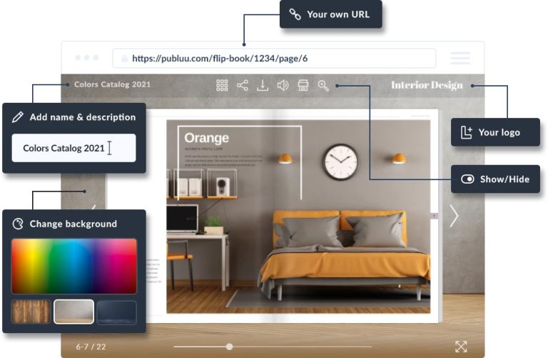
Time and time again, we’ve seen the importance of creating a clear and consistent brand image. To achieve this, your company needs a brand kit. This set of design principles is a powerful tool for maintaining consistency, and you need to share it with your graphic design, sales, and marketing teams through a cloud-based flipbook technology accessible to everyone.
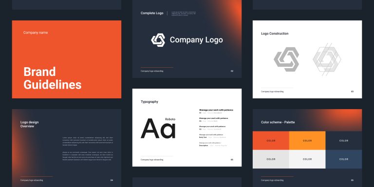
This guide will help you understand what a brand kit is, why it's important, and how to create one. Whether you run a small or large business, you’ll learn how to use these kits to build trust and attract more customers from this text.
What is a brand kit?
A brand kit is a comprehensive document created by a company to help all its employees represent the company in a consistent way. It serves as a shared resource, describing the style of advertising, marketing, and graphics - for example, iconic colors (like red and white for Coca-Cola), logos and fonts, or the style of written messages and images (e.g., formal, professional, familiar etc.).
By following the rules outlined in the brand kit, marketers stay consistent when creating messages, ads, or social media posts, thanks to clear boundaries and guidelines. The brand kit is important for your employees, external partners - especially advertising agencies - and freelancers working for your company.
Why create a brand kit?
A brand kit is a manual detailing how you want your brand representation to look across all communication channels. Here’s why it matters:
✔️ Creates consistency in your marketing efforts
- A brand kit allows you to preserve your brand identity in all channels
- Helps customers recognize your brand instantly
- Consistent presentation builds trust in your brand – which results in more sales
✔️ Increases efficiency
- Eliminates guesswork and speeds up the design process
- Access to the brand kit reduces errors
✔️ Improves collaboration
- Provides clear guidelines for internal teams if you share it with employees
- Helps external partners understand your brand
- Streamlines onboarding for new team members
What’s included in a branding kit?
Your logo
A well-designed logo is the cornerstone of your brand's visual identity. It's the first impression you make on your audience and should be instantly recognizable.
- Vector format: Make sure your logo is saved in a vector format (e.g., .AI, .EPS, or .SVG) to maintain its quality when scaled up or down
- Multiple versions: Prepare various versions of your logo for different applications. This includes color, black and white, and different sizes
- Usage guidelines: Establish clear guidelines for logo usage, including acceptable modifications, color variations, and appropriate placements
Your colors
Choose special colors that will be uniquely associated with your brand - like the iconic shade of green that immediately makes people think of Spotify.
- Color psychology: Understand the psychological impact of colors on your target audience
- Color palette: Develop a consistent color palette that includes primary, secondary, and accent colors
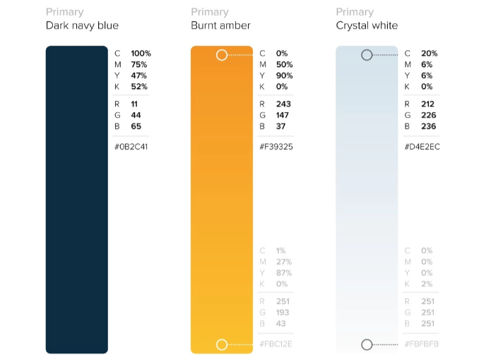
- Color codes: Provide precise color codes to ensure consistency in all marketing materials
- RGB for digital use
- CMYK for print materials
- HEX codes for web applications
Your fonts
You can choose a font for your company's main logotype (the name next to the logo), but it's also a good idea to choose the fonts you'll use in your messages and products. For example, Google often uses Roboto, while Microsoft created Arial font as an alternative to Helvetica.
- Font selection: Choose fonts that align with your brand's personality and target audience. Consider factors like readability, versatility, and aesthetic appeal
- Font hierarchy: Establish a clear font hierarchy to organize different levels of information
- Font usage guidelines: Specify details like font sizes, line spacing, and kerning to ensure consistent typography across all materials
Communication style
Apart from the visual style, you should also describe the overall tone and attitude you want to project to your customers. For instance, Discord primarily targets gamers and, therefore, adopts an informal, friendly tone.
- Formal style: Best for most B2B companies or respectable brands. Use elegant words and avoid contractions
- Casual style: Works well for most customer-oriented businesses. You should maintain some distance, but there’s no need to write using formal language
- Informal style: Works best with brands targeting youth or those with a relaxed, lifestyle focus. Feel free to use slang, colloquial expressions, and keep the language light and accessible
Complete your brand kit with Publuu
Creating a brand kit is essential to provide consistency across your branding materials. Publuu serves as the perfect complement to your brand kit, offering an engaging way to present and share it:
Publuu's online flipbook example
MAKE YOUR OWN
If you want everyone to have access to your brand kit, save it as a PDF and upload it to the Publuu cloud. This way, it becomes accessible from any device, allowing everyone on your team to easily view and interact with your brand assets.
- Personalisation: Customize the look of your brand kit to match your brand identity by adding logos, colors, and custom backgrounds, Publuu ensures your brand kit reflects your identity perfectly.

- Interactive elements: Embed videos, images and, hotspots to make your brand kit more engaging and visually appealing. For example, you can add audio or animations to explain how to use the logo.
- Security and control: Protect your brand kit with built-in security features and control who can view it. You can restrict access to employees or visitors to a specific site.
- Virtual shelf: Some companies have a separate brand set for specific products or customer groups, like the chain of stores Poundland in the UK and Dealz in Europe. You can also create multiple brand sets and make them accessible through Publuu.
- Advanced analytics: Track performance metrics to understand how your brand kit is being used. For instance, you can check if a freelancer has opened the document and followed the instructions.
💡Check out what a brandbook is as well!
How to create a brand kit
A brand kit can be a simple file containing all you need to maintain a cohesive brand identity. Here's how to create it:
1. Create a logo
Your Digital Brand KitConsider using a vector graphics program like Illustrator, Affinity Designer, or the free Inkscape to create a scalable logo that looks sharp at any size. You can also convert raster graphics to vectors or prepare different versions of the logo for various uses.
If you prefer to use raster graphics, prepare high-resolution versions for print and smaller versions for online use. Save your logo as an SVG or AI file, and also prepare versions in PNG and JPG formats.
2. Configure your colors
Choose your brand colors carefully, considering how they resonate with your target audience and the message you want to convey. Always include accurate color codes in RGB, CMYK, and HEX formats for consistent application across all materials.
Use the free website Adobe Color to create a consistent color palette. The program will choose the right color harmony to match your main colors. Save your color palettes in PSD and PNG format and them in your PDF document.
3. Choose your fonts
Choose the fonts you want to use for text, headlines, and quotes. Secure licences and permissions for these fonts. While you can use an open-source font, keep in mind that you won’t have legal protection. Consider licensing options for paid fonts or hire a designer to create a typeface for you.
Prepare TTF and ODF files for your chosen fonts, as not everyone may have these installed on their computer. Include them in your brand kit.
4. Create templates (optional)
Create ready-to-use designs for your branding materials. You can share these on Publuu, presenting how to use your fonts, colors, and graphics. With our cloud, everyone in your team can find and use the right logos, colors, and fonts.
Brand kit vs. brand style guide
The terms "brand kit" and "brand style guide" can often be confused. In reality, brand guidelines often include almost everything that can be found in a brand kit. Here are the main differences between the two:
👉 Brand kit
This is a concise presentation and reference guide, showing the main elements of your brand's visual appearance. It provides quick and practical tips for using logos, colors, and layout. This document is shorter and more visual, making it perfect for day-to-day use. The brand kit is used to show people what your brand should look like.
👉 Brand style guide
This is a more complex document that contains detailed rules for everything related to your brand. It doesn't just show the logo, but explains where and how to use it, including specifications like the correct spacing between the brand name and the logo. Brand guidelines serve as a complete reference manual used to teach people how to use your brand elements correctly.
In summary, use a brand kit to quickly show someone the look of your brand, and use brand style guide to demonstrate exactly how to create something for your brand. Both documents are important, but they serve different purposes.
Brand kit examples
Hulu
Hulu is a brand taht is easily recognizable at a glance, and the Hulu brand kit is a comprehensive guide covering more than 100 pages to help viewers easily identify it. The kit includes detailed information on trademarks, essential visual elements, color palettes and typography.
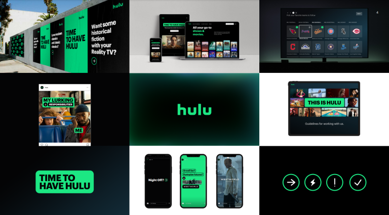
The well-known streaming company is committed to a clear and efficient user experience, which is reflected in the product design section of the kit.
The PDF document includes a variety of logos and icons, and gives examples how to apply them and when not to. In addition, there is a dedicated section defining the right tone of voice for marketers.
Finally, the kit includes a section dedicated to campaigns, like Pride or stories about Asians and Pacific Islanders, where the brand can very its colors to suit the theme.
Netflix
Netflix, the streaming giant, is famous for its iconic branding. In addition to the bold red “N” logo, Netflix has masterfully integrated sound into its brand identity. The distinctive “ta-dum” sound effect, associated with cinema, is as much a part of the branding as the logo.

Netflix's brand kit includes detailed guidelines to maintain brand consistency. It emphasizes the use of emotionally evocative images and storytelling, which is in line with the platform's strategy.
The kit also offers specific instructions on using the Netflix logo and wordmark, including proper spacing and contrast. By following these guidelines, designers and marketers can maintain the integrity of the Netflix brand.
As you can see, Netflix has secured its brand site. Similarly, Publuu flipbooks can offer restricted views, ensuring that only authorized partners have access.
Yelp
Yelp's brand kit, called the Cookbook, is a comprehensive guide to the company's visual identity and brand guidelines. As the name suggests, it takes a "cookbook" approach, outlining the ingredients and steps needed to create a consistent and engaging brand experience.
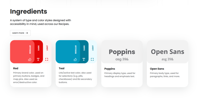
It describes the color palette, fonts and icons, and principles of projection. Yelp emphasizes a user-centric approach, focusing on ease of navigation and usability.
The Yelp brand is built around its community of reviewers and its mission to connect people with local businesses. The brand guidelines highlight the proper use of the Yelp name and logo, as well as the correct attribution of reviews. The company also promotes a strong community culture through initiatives such as the Yelp Elite Squad.
Medium
The Medium brand kit is a comprehensive guide to the platform's distinctive visual identity. It provides detailed guidelines for the use of the Medium logo, wordmark, and icon.
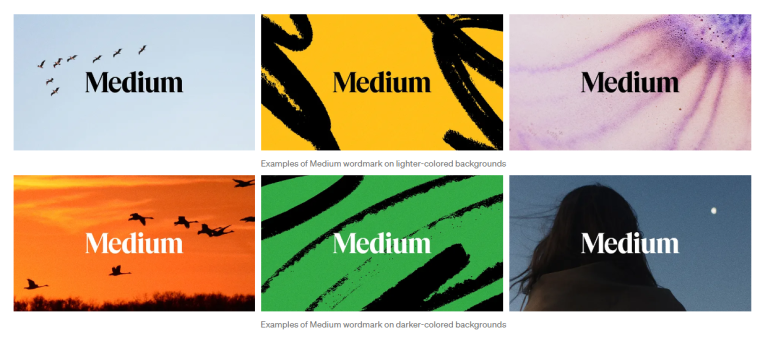
The brand kit website demonstrates the importance of proper spacing and color combinations for optimal visibility and readability. It also provides guidance on how to use the logo in different scenarios, such as when space is limited or when the logo needs to stand out against a complex background.
NASA
NASA's Graphics Standards Manual is a comprehensive guide that outlines the agency's branding guidelines. This extensive document, spanning over 200 pages, provides detailed information on how to use NASA's logo, color palette, and typography. The most recent version is paid for external viewers, but you can access the original 1975 version for free.
The manual covers a wide range of topics, including the branding of spaceships and other NASA assets. It ensures that NASA's visual identity remains consistent and professional across all platforms and communications. Even though NASA is a government agency, it also needs to take care of its image - and studying its classic branding kit, you can learn how this powerful brand evolved.
Shopify
Shopify's brand kit shows how to apply brand aesthetics associated with growth and opportunity.
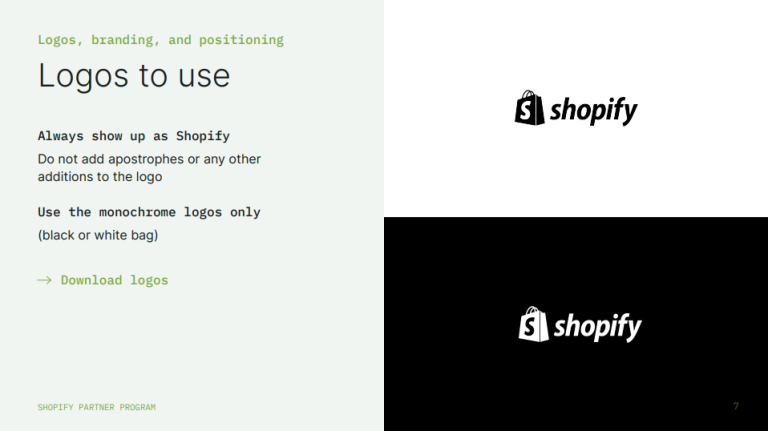
The iconic shopping bag logo represents e-commerce and can be used for brand identification without the wordmark. Shopify's color palette, centered around a distinctive green, conveys a sense of growth and success. The custom Shopify Sans typeface ensures brand consistency across all platforms.
Shopify's brand kit also includes detailed guidelines for the correct use of brand assets. It covers topics such as logo usage, color palette, and typography. The kit also provides examples of how to use the brand in different contexts, such as social media and print materials.
Mailchimp
Mailchimp's brand kit reflects the company's playful and approachable personality. The kit features a distinctive color palette, logo, typography, and imagery that aligns with the brand's mission to empower small businesses.
For example, the brand kit encourages the use of fun, hand-drawn illustrations to resonate with small business owners.
Conclusion
A brand kit is a great way to keep your brand looking consistent and professional across all your marketing channels. It's a convenient reference guide for key visual elements like logos, color palettes, and typography – even though it's not as comprehensive as full brand guidelines.
The brand kit makes it easier for teams to work together by giving them clear instructions for these design elements. This helps to avoid mistakes and keep the brand looking consistent.
It doesn't matter if you're a small business or a big company – if you put the time in to create a well-organized brand kit and publish it on Publuu Cloud, you'll get stronger brand recognition, more customer trust, and better business results.
A brand kit is more than just a collection of design resources. It's a strategic tool that helps build and maintain your company's visual identity in an increasingly competitive marketplace.
You may be also interested in:
How to Write a Convincing Brand Story in 11 Simple Steps
