Digital product brochures – all you need to know
Grabbing your customer's attention is all about the visuals.
Best graphic, best designs. Multiple templates. Will it be enough?
Now, there are many ways to put it all together. A product brochure is one of them. It combines all of your products into one marketing material, that your customers will be happy to look at.
In this article, we will explain how to put together a great product brochure.
The increasing importance of digital brochures
The Internet has changed the way we do things. The business is one of them. In fact, it just keeps evolving. Facebook and Instagram are yesterday's news. Now it's all about Tik Tok. Who knows what's next?
It's the same thing with product brochures. At first, you couldn't imagine life without them. Then, they were almost never used. Recently, they seem to be coming back. Stronger than ever.
What gave the digital product brochure a final boost?
Improved tools for marketers.
Facebook's landing pages, carousels, Amazon's display options: they all exist for the same reason - to give your products a chance to shine.
Your brochure templates can be easily adjusted to fit in with any one of those formats.
Pro Tip: Make your product brochure with Publuu!
Putting all the pieces together is hard work. Not to mention tools and design skills needed.
What if there was a tool that could do it all for you?
With Publuu's digital brochure maker , you can create your brochure design in no time!
Get your product pages, save them as a PDF and upload them to Publuu.
Let it do its magic.
What you're gonna end up with is a fully animated flipbook . It flips pages like a real thing. And you can share with anyone with just a single URL.
Publuu’s digital brochure example
Now, make another products brochure for each one of your product categories. Turn them into flipbooks as well. You can turn multiple flipbooks into a web kiosk - an interactive digital display.
Virtual Bookshelf lets you share all of your product brochures all at once. What your customers will see is a fully animated display of colorful brochures templates , filled with your products.
With Publuu you will save time and money and in return, you will get something that no brochure template could offer.
Register and try it out yourself, for free.
What is the best stage in a buyer’s journey to use a product brochure as a guide?
So let's talk about a sales funnel for a moment.
There are 4 different stages of the buyer's journey.

The first one is brand awareness. It's when a customer finds out about your product. It can be someone completely unaware of their need, or someone who is buying certain goods on a regular basis.

The second stage is called consideration. Ideally, it's a customer that is looking to buy something, that can be found in your product brochure. But that's not always the case. It could be a customer, that is looking to solve a specific problem. For example, save money on his/her commute. If you are selling bicycles then your product could be a solution.

The third stage is intent. The customer knows what are they going to buy. They also know where. This stage is part of the reason why your product brochure should include your contact info.

The fourth stage is a purchase. Money changes hands. Everyone is happy.

Some marketers like to add a fifth stage: loyalty. It's when the customer is happy with your product, that they recommend it to everyone they know.
Now, which stages are ideal for your product brochure? First and second. It's when a potential customer makes up his mind. Back in the day you would give a fold brochure to any customer that has come your way. Tri-fold brochure if your business was doing well.
If your brochure design was attractive then you should stay on top of their minds for some time. And if you used Publuu fr your brochures - you will be remembered as the most unusual product brochure your customer has ever seen!
6 Best practices to follow while designing a brochure template
So while brochure design is a highly creative process, there are few guidelines to follow.
If you are using brochure templates that you found online, then more power to you. Some of those guidelines will be already included in the template.
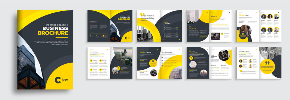
1. Insert a timeline to show the history of your product

Source: Freepik
We love "hero" stories. We love them so much that despite hearing them over 1000 times we still crave for more. That's why Hollywood (and Netflix) keep releasing the same "underdog saves the day" movies. We just can't get enough of them.
The same thing goes for brands, products and services. Use your product brochure to show your customers where you started and how far you've gone. They will start rooting for you.
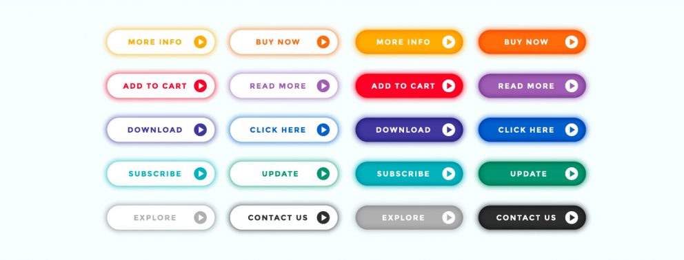
2. Use bright colors and icons to highlight calls to action

Source: Freepik
Call to action, or CTA is one of the key elements of every marketing campaign. If it's written well, it can do wonders for your sales. It's always a good idea to boost your CTA with a little design trick.
3. Make data easy to understand with compelling data visualization.
A good product brochure is not only about WHAT can you offer. It's also about WHY. Give your customers a reason to trust you and your products. Performance test results? Customer reviews? Organize your graphics into colorful pie charts. Let your customers get to know, that you know your stuff.
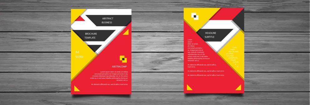
4. Use visuals consistently throughout your brochure templates

Source: Freepik
Most of the free brochure templates available online should have this one covered. But you should double-check anyway. Fonts, graphic patterns, stock images. If one of your brochures is bright red and the other one black and white, then it will be difficult to tell that they are coming from the same company.
5. Make sure your contact information is easy to find

Source: Freepik
Front or back of the brochure? Maybe in the middle?
Imagine that a customer liked your products and your brochure design. He is ready to make a purchase. But, he can't find your phone number right away. He lost interest and decided to buy from someone else.
Make a clear headline: "CONTACT". And put all your information there.
6. Use a contrasting color to highlight important information

Nobody likes cheap tricks. But, what can you do if they work so well? While your brochure design was made to look good and professional, it has one purpose. It needs to sell.
And to do that, you need to attract attention to certain elements. Like price, or your website's address.
So don't be afraid to adjust your brochure template a little bit. Change the color of key elements for something brighter, but only when it's necessary. Make a prototype and show it to a few people to make sure that you didn't overdo it.
Product brochures can surprise you with how well they are converting. Just keep our tips in mind and you will see it for yourself.
We hope that you found this article useful. And, if there's anything else you would like to know, feel free to ask a question in the comments.
You may be also interested in:
The Best Online Brochure Maker in 2026
How to Make a Pamphlet?