Tips For Creating the Perfect Travel Brochure
Many travel industry professionals have been affected by the recent Covid crisis, and tourism is about to undergo profound changes. This industry will change rapidly in the coming years, but travel agencies and tourist attractions must still continue to advertise. A travel brochure, especially in the form of a digital brochure is a great way to attract customers and visitors to any place that's interesting enough. Your hotel or resort doesn't have to be a typical tourist trap. You can create a travel brochure and publish it online even if you run a store, a zoo, or even a nature preserve.
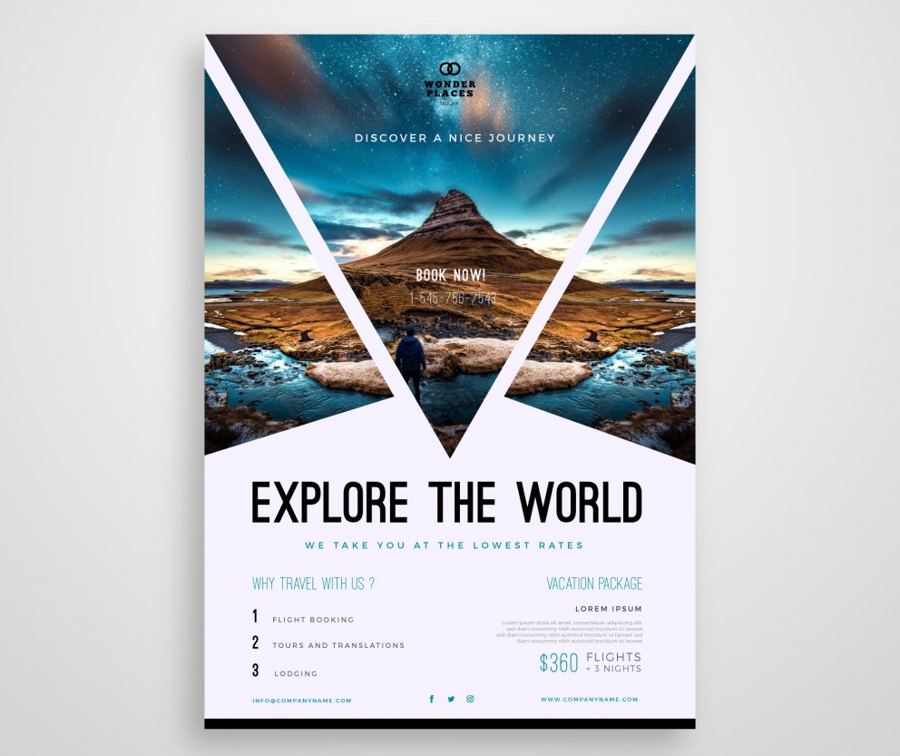
What is a travel brochure?
A travel brochure is usually found at a travel agency, sitting in a stand among other leaflets. It’s essentially a promotional leaflet that can advertise your hotel, tour, vacation package, or even some other tourist attractions. Travel brochures help people to find and book their vacation and contact professionals in the tourism industry – such as yourself.
Many people use traditional trifold brochures, which essentially have six foldable pages. But that’s not the only style of travel brochure available today. Many modern brochure templates are similar to product catalogs and are booklets detailing your tourist attraction.
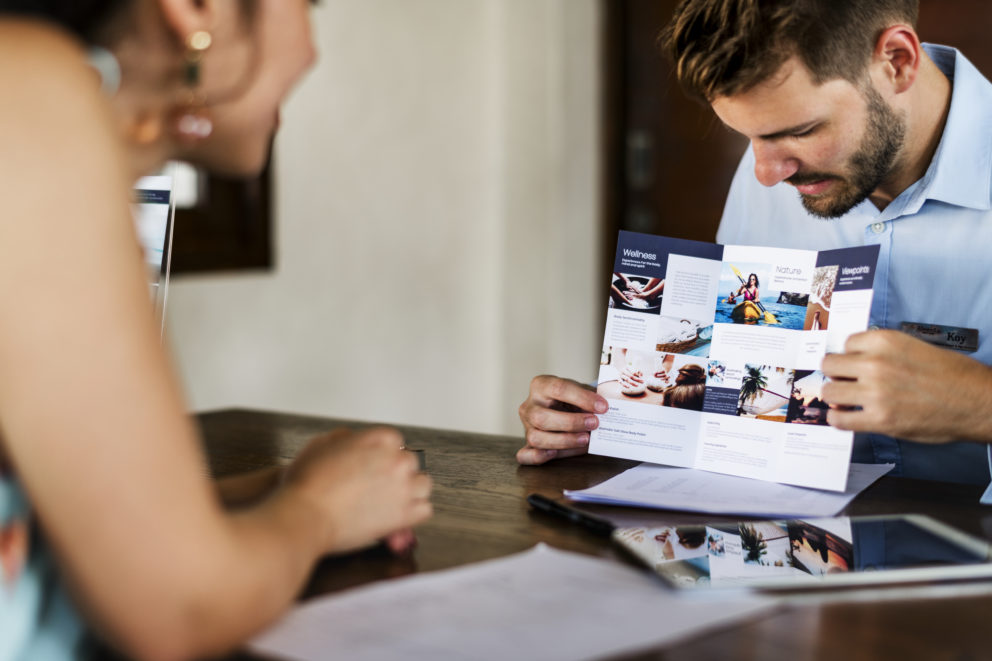
How to make a travel brochure?
In part thanks to the current situation, more and more people book their vacation online. They don’t need the traditional trifold brochure, but they will definitely get some use of an online flipbook available on any device. With Publuu, you can share your travel brochure with others, especially on social media of your profile or your travel agents!
Publuu’s online brochure example
View more online brochure examples
Learn how to share your travel brochure with Publuu.
How to use a travel brochure?
Consider how a travel brochure can add value to your marketing efforts. Will it be simply sitting on your customer's desk to remind them of a trip to paradise? Or will it serve as a collection of contact information? Do you want it to help your business attract more visitors? Are you perhaps looking for potential customers, or even investors or business partners?
Think whether the customer will be able to find the travel brochure at a travel agency, receive your brochure in the mail, or maybe you could make it available online using Publuu. In this way, you'll be able to reach new prospective customers who'd never even meet your travel representative otherwise.
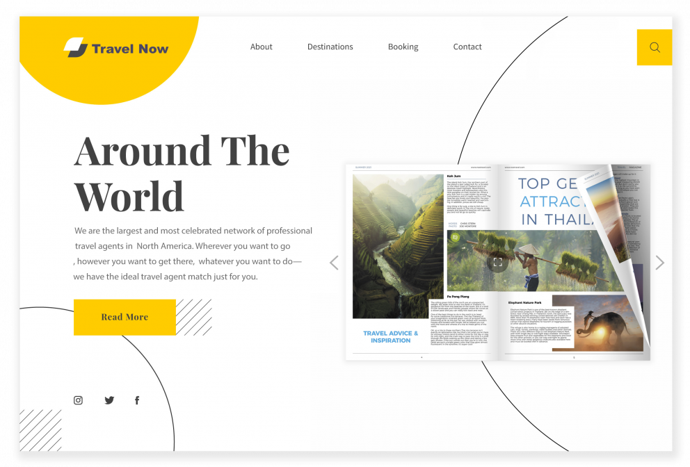
Consider how your travel brochures will be used and customize your design based on that. If you need maps, presentations, or decorative frames or outlines, pick the travel brochure template that will include these elements.
Travel brochure templates
Various travel brochure templates available online are using a variety of possible folding styles that can be used to design a classical brochure. You don't want the folds to cause a break in the text or create too many sections to fill later – this will make it harder to manage your content. The style of the brochure must also match your company's brand or the message you want to deliver. If you're running a casino, using kid-friendly content is probably not the best choice.
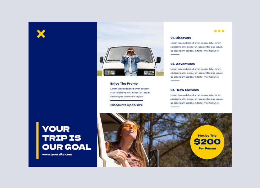
Most travel brochure templates include a variety of designs for 2, 3, or 4 folds – the one most commonly used is probably the tri-fold brochure. You can also decide to publish your brochure in a booklet form, which will make it more respectable and harder to misplace. Publishing your brochure online requires preparing a good quality PDF, and Publuu makes it easy to transform it into a beautiful-looking booklet.
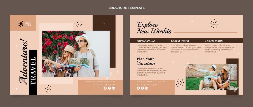
The most important limitation when designing traditional brochures is that each box or page must be quite narrow. Many brochure templates only have room for just a few words next to the images, so don't overdo it with the text and certain headings. That’s why it’s probably more beneficial to design a small, 16-page, or shorter booklet and publish it online. Keep the content short and to the point, relying on images instead.
You can also check Publuu's brochure examples for more inspirations.
Make people want more from your travel brochure
When creating your travel brochure, you are probably thinking about what you want from it. Spare a moment to think about what the potential consumer would want as well. Once you've figured out who'll be reading your brochure, you need now to determine why, and what you will include. If your offer is aimed at young couples, you know that your travel brochure template should avoid the metallic colors or abstract logos that are usually associated with the business.
When designing travel brochures, avoid describing your offer in complete detail. A brochure is not a catalog or complete description of your services or products. Don't overload the leaflet with information – this stresses people, and they want vacations, not stress if the brochure design is too overwhelming!
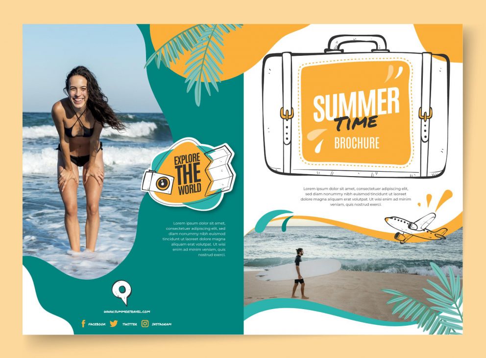
You want to pique the interest of the prospective visitor so that they visit your website or social media profile and try to contact you. That's also why the text of your travel brochure should include a call to action. Put some contact information on the last page of your brochure, include links to your social media, and invite your prospects to contact you!
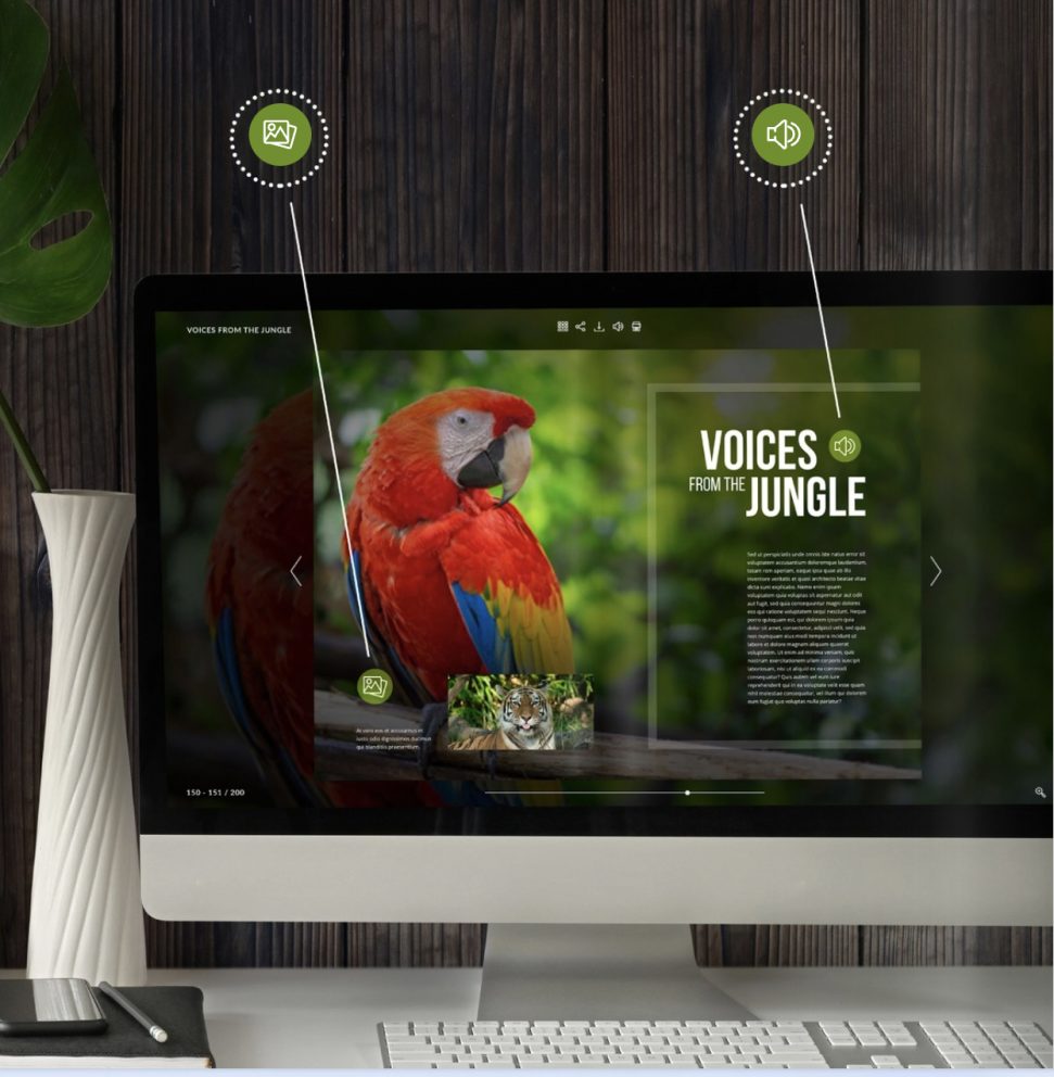
With Publuu you can add hotspots with extra photos, videos, links or even audio files to your online travel brochure. This is also a perfect opportunity to show even more things you have in your offer.
What to include in a travel brochure?
Eye-catching graphics and a well-designed brochure templates
Tourism is an industry that relies heavily on visual elements. That's why every travel brochure template includes space for large images or beautiful art. You can place them in the most important parts of your brochure to attract attention, and supplement them with contrasting visuals and color schemes. Use the remaining space to showcase the most important elements of your offer and the reasons to visit your tourist attractions. Remember, sightseeing is named this for a reason!
Marketing services or guides is even simpler – because such businesses tend to cooperate with the local attractions. Talk with your business partners about whether you can use their assets in marketing yourself – after all, they will also benefit from more tourists in the area.
Designed by Freepik
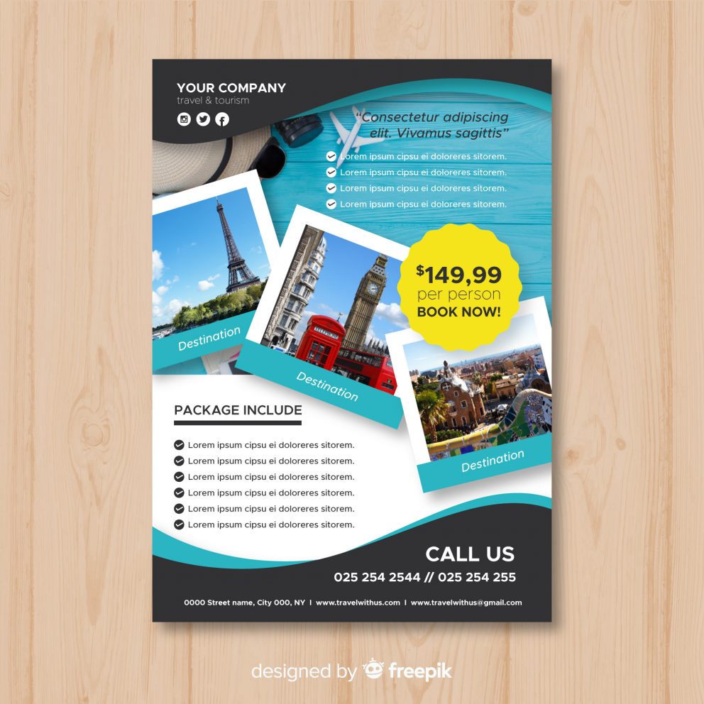
When presenting the brochure, it's important to use real images of your hotel or tours. The customers will be rightfully disappointed if your advertising doesn't reflect the actual content and the reasons for their expensive visit. The graphic elements included in your brochure template should also match your general style and attitude – if you don't have anything to do with pirates, don't include images of these salty sea dogs just because you want to attract family tourists! Your offer should include images tied to the theme of your resort or attraction – try to think of the altogether experience you want to sell, rather than all these individual features.
Avoid pictures of your staff, even if they could be relevant. The customers are more interested in themselves. Even if your fitness trainer is a local champion, the visitors will be, sadly, more interested in how they will themselves look after the workout. Try to discover things and ideas your guests will find exciting and different.
Stay unique – depart from the tri-fold brochure scheme
The cover of your travel brochure is the first thing your customers will see, whether among other brochures or as an icon on the website or social media profile. That's why an attractive cover page – both the logo, the illustrations, and the tagline – is so important to your offer. Your potential customers see all kinds of marketing materials: flyers, photos, travel agency catalogs, and social media ads every day. In the competitive travel industry, you need a standout illustration that will make the customers simply pick up and open your brochure. That's why even if you are using premade brochure templates or stock photos, remember to alter them to make your first impression different from your competitors'.
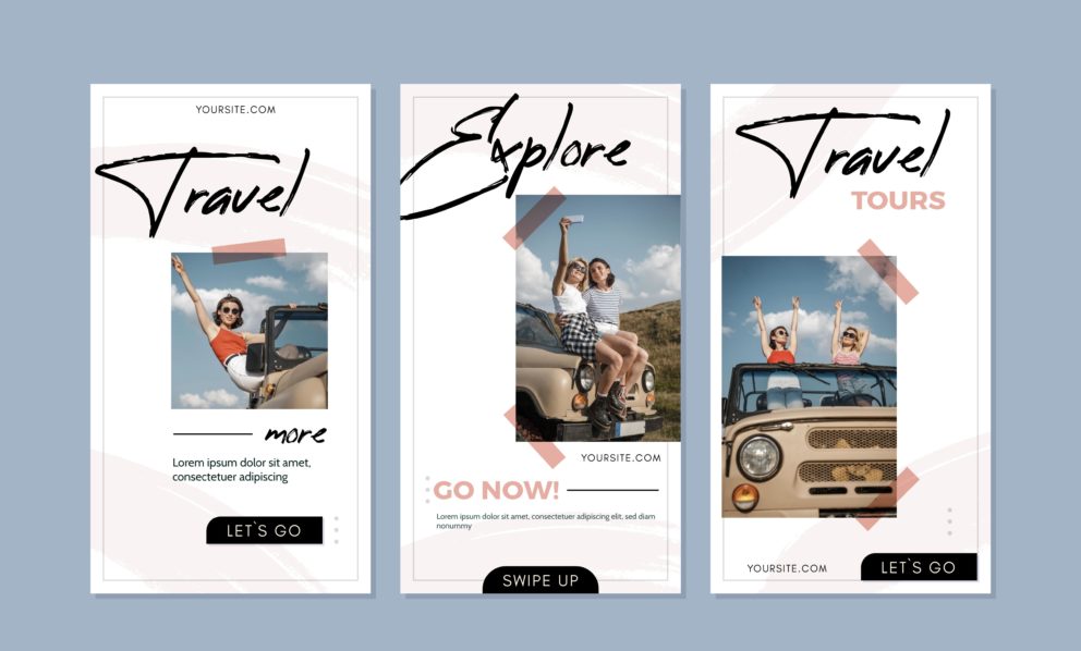
The main idea is to use unusual colors or recognizable symbols. A professionally designed brochure balances the need to represent your brand, culture, and associations with the need to remain unique. Recognizable models or graphics, eye-catching details – all of this can attract the attention of the bored people browsing the offer rack at the travel agency.
Make your brochure stand out with Publuu
Remember that your travel brochure will be competing with dozens of others when you display it in a travel agency booth. That's why it's also a good idea to offer your brochure online with Publuu, because you can highlight the flipbook style and your partners can embed your travel brochure on their website or social media profile. After all, the more people will see it, the better!
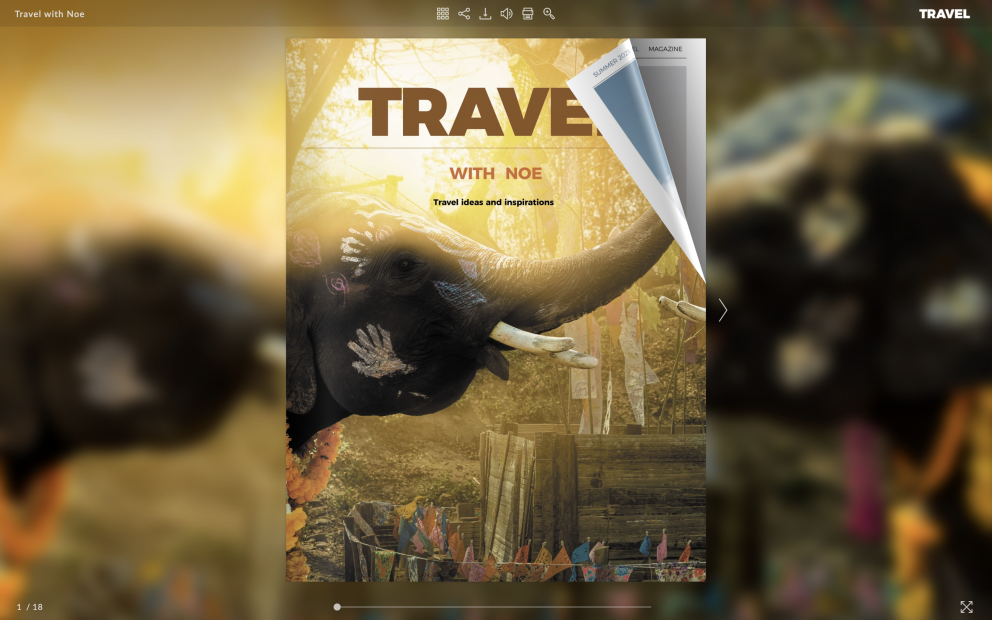
Publuu offers you also a unique capability to link to your resources. This is a fantastic advantage you have over the printed media – think about being able to link to professionally designed videos presenting your tours and hotels!
Good writing is the heart of your travel brochure
The text in your travel brochure should tell a story that grabs the viewer's attention and makes them want to learn more about your holiday offer. The reader is supposed to be the star of this story, from start to finish. If they imagine that they are on vacation and relive each adventure in their thoughts, then this is a good travel brochure with the fantastic copy.
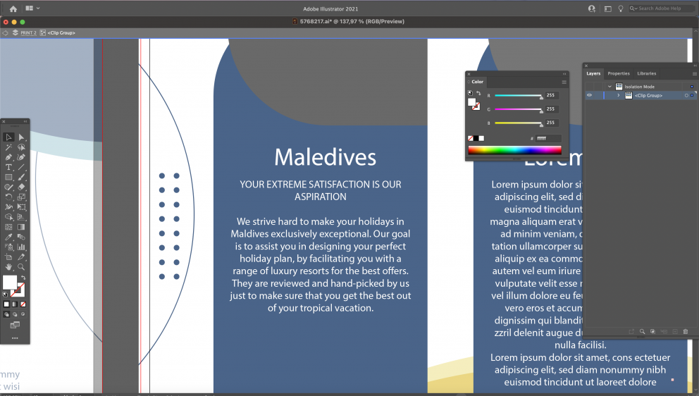
Avoid complicated words, unusual phrases, and fanciful jargon in your marketing material. This can confuse the reader or make your text difficult to understand. Remember to use the services of professional translators if your target is foreign tourists to avoid embarrassing mistakes! If you show you're not ready for guests abroad, they won't arrive. Instead, use everyday language that everyone will understand.
When you begin designing a new project, especially as a beginner, it's tempting to go overboard with all the fonts you want to use. Many typefaces in your travel brochure might be entertaining, it can, however, also seem overwhelming and immature by your potential buyers. Decide on a few fonts and stick with them. Avoid over-the-top designs like Comic Sans or papyrus – they will make your travel brochure look very 90s.
Summary
The most important thing about brochures is that they aren't books or catalogs. They're flyers or leaflets: and your goal is to make the reader want to keep them after he gets them in hand. You want to create a design that will last for a long time.
In print form, you might want to choose high-quality paper, outstanding fonts, and colors, and include relevant information. Online, many people don't want to download the PDF file to their computer – you can make it memorable with Publuu's online designs.
You may be also interested in:
The Best Online Brochure Maker
How to Make a Brochure?
How to Make a Pamphlet?