Event brochure guide: Templates, ideas and tips
If you're in the events industry, you already know how much attention social media gets. But at the end of the day, an event only works if people actually show up. Virtual formats had their moment, especially during the pandemic, but in-person experiences are still what drive real engagement. And when it comes to getting people through the door, a well-designed event brochure still does its job.
Today, attendees receive too many emails and ads, most of which get ignored. That's why a thoughtfully designed brochure stands out, whether it's printed or created as an online flipbook. In this article, you'll learn how to create an event brochure that works and make sure it reaches your audience.
What is an event brochure?
An event brochure can be both physical and digital. Designed to promote an event while also providing the key information people need. It usually includes details like the schedule, location, speakers, and a map. All of this is presented in a clear and easy-to-follow format.
For example, every business conference brochure I've ever gotten includes the rules, hotel location, exhibition area, meeting room schedules, and discount coupons for some nearby restaurant.
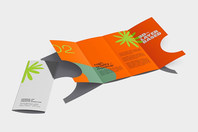
In practice, it's not just about promotion. A well-prepared brochure helps people navigate the event and understand what to expect before they even arrive. Below, you can see how one of our clients prepared their event brochure.
Publuu's event brochure example
What makes an event brochure effective
Think about it for a second - why are you creating a brochure in the first place?
In most cases, the goal is simple. You want people to show up at your event. That's why everything should focus on the reader, not the event itself.
Start with the benefit. People don't care that your event is "huge" or "historic"- they want to know what they'll gain. This is the core of the "What's in it for me" (WIIFM) principle. If you have a strong speaker or a standout feature, make it clear right away.

Another really important thing is visual hierarchy. The reader should understand the basics right away, with the most important elements standing out immediately. People scan rather than read word-for-word. So don't create walls of text. Use bullet points, bolding, and remember: white space is your best friend.
People will trust you a lot more when they see how much fun everyone had at your previous events. Real photos from past events feel more convincing than stock images. Recognizable partners or sponsors can instantly strengthen credibility. Alongside that, your brochure still needs to be informative, with clear details like date, time, location and schedule.
Don't forget to include a clear call to action. Tell people exactly what to do next and make it easy for them to do it. Give the first ones a discount. Want them to download your app? Include a direct link or a QR code.
Event brochure layout ideas and templates
You can find a ton of templates online (for example InDesign or MS Word). In practice, most brochures follow a few proven formats, but you can also experiment with more creative layouts depending on your event.
The tri-fold
This is the most popular format out there. It consists of three panels that fold into each other, giving you a total of six sections to work with. It's cheap to print, super compact (fits right into an envelope, pocket or purse) and easy to place on stands at trade shows.
The content reveals itself to the reader as they open it, which keeps things feeling organized. Once fully opened, all three inner panels are visible at once, letting you hit them with your main message right in the center.
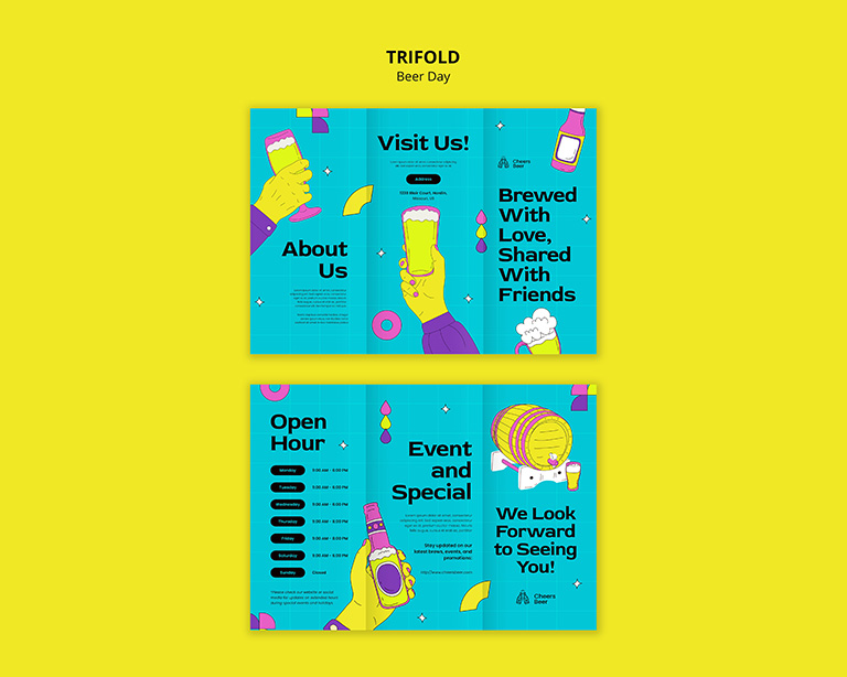
The cartoon beer motifs of this brochure make it look cool and the colors will help you stand out.
 View template here
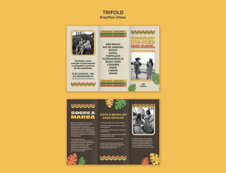
Latin American colors and styles make this brochure perfect for international events.
 View template here
The bi-fold
This is literally just a sheet of paper folded right down the middle. You can keep it symmetrical or use an asymmetrical fold to reveal part of the inside content.
It gives you wider panels than the tri-fold. That means way more room for big, eye-catching photos, graphics, and chunkier blocks of text.
It works best for events where visual impact matters more than presenting a lot of detailed information.
The external side of this brochure template can function as a poster.
 View template here
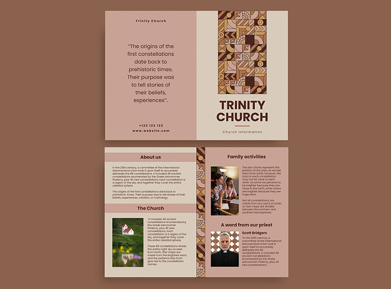
This template advertises a church, warm tones and geometric patterns can work for any industry.
 View template here
The gate fold
Similar to the tri-fold, but its two wings open up like a pair of double doors (they don't overlap like a standard letter fold). It definitely gives off a more premium, elegant vibe. You still get three panels on the inside, but you have a distinct front and back on the outside.
This is a good example - and it shows how you can add extra material to your brochure.
View template here
When your brochure needs more space
Sometimes a standard folded layout won't be enough. If your event includes a detailed agenda, multiple speakers, or complex venue information - you'll need more space to present everything clearly.
In these cases, it often makes more sense to create a digital version of your brochure. This allows you to organize content across multiple pages without overwhelming the reader.
With tools like Publuu, you can turn your brochure into an interactive format that's easier to browse, update and share. Instead of squeezing everything into a limited layout, you give your audience a smoother way to explore the content. Digital brochure presented below is colorful and shows how interactive functions work: you can not only learn more about the realtor event but also visit the company website with a single click.
Publuu's event brochure example
How to design an event brochure
Follow these steps to create an event brochure that pops out and immediately draws the attention of a reader. It's not complicated, but a few details make all the difference.
Step 1: Figure out who you're talking to
Before you design anything, get clear on your audience. Your wording and visuals should match the specific group you're trying to reach - their age, income, lifestyle and even background. If your offer is pretty broad, it may make sense to create two separate brochure versions.
For example, if you're promoting a wedding expo, you'd present it one way for exhibitors and a totally different way for guests.
Step 2: Create a cover that pulls people in
The front page is your one shot at a first impression. People decide in less than a second whether your brand feels trustworthy or not. Skip the generic stock photos and use something real instead - your best product photo or a great shot from a previous event will be a great choice. Keep in mind that the text on the cover should be short but intriguing. Its job is to make people want to open the brochure. Think of it like a hook.
Step 3: Write in a simple, benefit-focused way
Avoid overcomplicating your language. Even when targeting professionals, clear and direct communication works better than jargon. Simple always wins. Write like you're talking to someone directly, not lecturing them.
Step 4: Use smart headlines and a bit of storytelling
People scan brochures rather than read them in detail. Your headlines need to instantly tell people what's inside. Instead of a boring heading like "Information" go with something clearer and more human, like "Who we are" or "Our books".
Instead of empty claims like "the best in town", give people something concrete. Real numbers and stats work way better. For example:
"In 2025, our event welcomed 5,000 attendees from 15 countries"
Step 5: Get the visual details right
Consistency with your brand is huge, especially at trade shows and conferences. Stick to no more than 2–3 fonts: one for body text, and another for headlines, maybe in a few different sizes. Sans-serif fonts feel modern and startup-ish, while serif fonts give off a more traditional, premium vibe.
Same goes for colors - keep it to 2–3, ideally your brand colors. In print, too many colors can just feel messy and overwhelming.
Step 6: Pick the right material
If you're printing your brochure, the paper quality says a lot about your brand. Heavier paper feels more premium, while very thin paper is often treated as disposable. Be careful with glossy finishes, as they can reflect light and make reading less comfortable.
Step 7: Add a digital version
Instead of stressing over printing costs and transporting stacks of paper around, you can also create an online version of your brochure.
If you're not sure whether it's worth it, the next section breaks down the key benefits of going digital.
Make your event brochure interactive
A standard brochure in a digital format is just the starting point. From our experience, adding interactive elements helps people explore and engage with the content more effectively.
Instead of scrolling through static pages, readers can move through the brochure more naturally thanks to the page flip effect, which gives the experience similar to a real publication.
You can also enrich your content with videos, image galleries and clickable elements. This works especially well for showcasing speakers, highlights from previous events or additional resources.
Interactive elements like links or buttons helps readers to take action straight away. This becomes even more effective when you use features like lead generation forms.
Presenting your brochure this way gives you more flexibility. You can update content at any time without worrying about reprints or outdated information. Below, you can see how easy it is to update your brochure without changing the link.
Digital vs printed event brochures
Now that we've covered the available options, it's time to compare them side by side. Each format has its strengths, depending on how you plan to use and distribute your brochure.
| Aspect | Printed brochures | Digital brochures |
| Cost | Higher upfront costs (printing, shipping, storage) | Low distribution costs; one-time setup |
| Updates | Can't be changed once printed - mistakes are permanent | Update anytime, instantly, even after distribution |
| Reach | Limited to physical distribution; needs hand-to-hand or mail | Unlimited reach; shareable via email, social media, QR codes |
| Interactivity | Static content only - text and images | Interactive content: Videos, links, animations, clickable buttons |
| Tracking | No way to track who reads it or for how long | Full analytics: views, time spent, click-through rates |
| Format | Physical presence makes it memorable; feels premium | No physical presence; easier to ignore or delete |
| Longevity | Can sit on desks or in bags for weeks; won't disappear | Can be lost in email clutter; requires device to view |
| Environmental impact | Uses paper, ink, and shipping - higher carbon footprint | Eco-friendly; zero waste |
| Accessibility | Must be physically available; can get lost or damaged | Accessible 24/7 from anywhere with internet |
| First impression | High-quality paper = premium feel and credibility | Professional design still matters, but less physical feel |
| Best for | Trade shows, direct mail, high-end events, older audiences | Quick distribution, tech-savvy audiences, ongoing events, last-minute updates |
Event brochures final thoughts
If you're organizing events, forget about the old-fashioned "just print flyers on white paper" approach. A well-designed brochure is still one of the most effective ways to encourage people to actually show up.
A brochure works best when you treat it like a mini-conversation with your audience: inform and present. Whether you choose a digital brochure or a printed one, you need to tell a good story and encourage people to participate.
FAQ about event brochures
What should an event brochure include?
Your event brochure should clearly explain what the event is, why it's worth attending and how to take part. In practice, this means including key details like the date, location, main highlights or speakers, and a clear call to action.
The best brochures don't try to include everything. Instead, they guide the reader through the most important information and make the next step obvious.
How long should an event brochure be?
It really depends on the event. If you just want to let people know it's happening and get casual fans interested, a simple tri-fold does the job. But if you've got tons of instructions, venue maps, and a detailed schedule, you should consider a more detailed format or a digital version.
You can start handing out promo brochures months in advance (they're great to have at other industry events). As for digital brochures, share them as soon as your schedule is locked in. For the physical copies, those are perfect to hand out to people right as they walk through the door.
You may be also interested in:
Brochures – complete guide
Mastering Brochure Size: All You Need to Know
The Best Online Brochure Makers in 2026